In the last few articles on the Kandan Redesign Project, I talked about the designing the Hall page and designing the create, edit, and delete features of Kandan.
Today I will go over the design of the Notifications feature.
I had scoped in the following things for notifications when I defined the scope of this project.
Users should be able to receive notifications:
- From Public and Private Conversations they are involved in currently,
- When someone uses their @mention in other Conversations,
- When they get a Private Message.
If you are not following what I am saying, you can read the scope of this web application design case study.
Before we get down to the actual design of these notifications for the messages being received, let us first understand the different types of messages that the user can receive. Broadly these messages can be classified into the following 2 types:
- Users Messages: These are the messages that are sent directly by other users by calling out a particular user in some Conversation using the @mention or by sending a private message.
- System Messages: These are the messages being sent by the system when the user is added to a Conversation or removed from it or when a file is deleted from a Conversation etc.
Do the type of messages have any impact on the design?
No. But it’s good to be aware of these.
Now, there are 2 scenarios that we need to consider while designing the notifications feature:
- How to display the messages that the user has received while he was offline.
- How to display the messages that the user receives while he is online and is using Kandan.
Let us get down to the design of these two scenarios.
Designing the Offline Message Notifications
Once the user has logged in, we need to display all the notifications that have been received while he was offline.
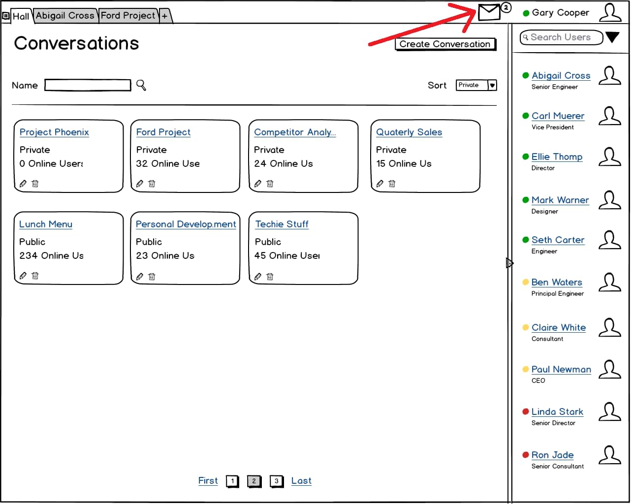
To design this, I added a “Notifications” icon on the top right of the interface besides the logged in user’s credentials as shown in below image.
Just adjacent to it is a number indicating the number of unread notifications.
When the user clicks on the notification icon, a drop-list will appear showing the notifications.
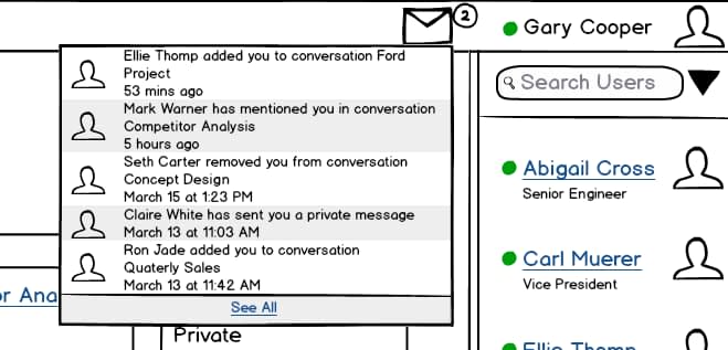
Each of the notification will start off by displaying the image of the user who is responsible for sending the notification.
Clicking any of the notification messages will take the user to the corresponding Conversation. And in case of private messages, the user will be taken to a tab displaying the messages between the two users.
I have yet not designed the Private Messages tab or the tab displaying the chats happening within a Conversation. That interface will be designed in the coming few days.
Coming back to the Notifications drop down, the user can see all the notifications by clicking the “See All” link at the bottom of the drop down list. This will take the user to the “Notifications” page that is displayed below.
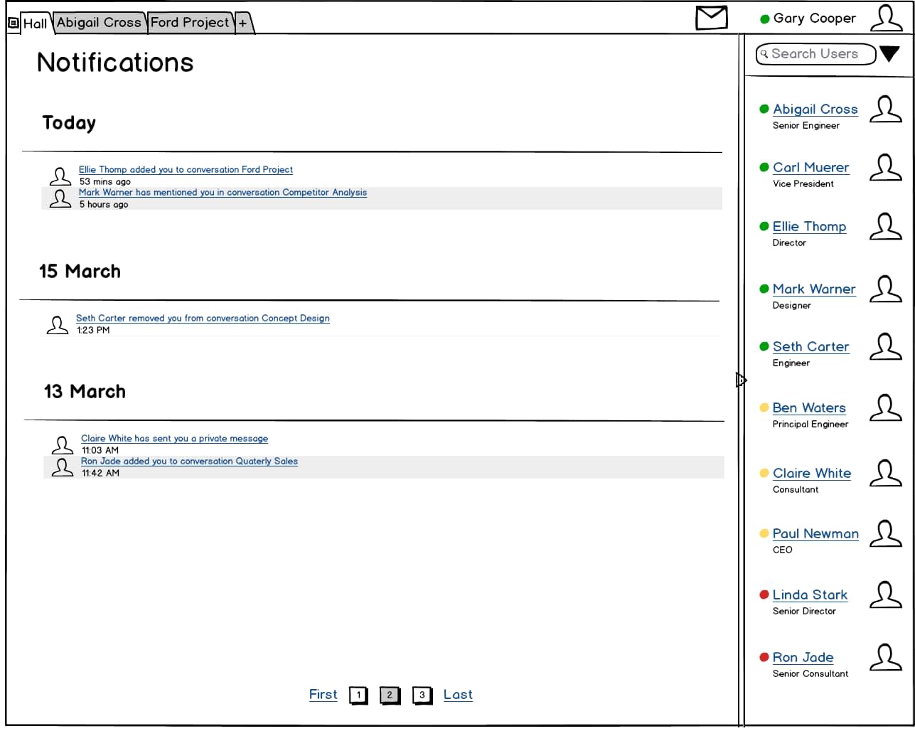
This page will display all the notifications one below another arranged by the date on which these were received. Latest notification will be on top.
The notification message text will be a hyperlink. Clicking it will result in navigating the user to the appropriate Conversation. Same as what would have happened if the user had clicked the notification message in the drop down list of the Notifications icon at the top.
Once all the notifications have been viewed the number adjacent to the notification icon will no longer be visible. That number will only get displayed if there are any unread notifications.
This completes the notifications design for the offline messages. Now let us design the online messages.
Designing the Online Message Notifications
Online messages are a little tricky to design because just increasing the count of unread notifications on the Notifications icon might not catch the user’s attention.
Somehow we need to make the user notice the Notifications icon.
One way of doing it is to change the color of the icon. But it is a very small change in the UI that the user can easily miss.
The other way of achieving this is how Kandan does it currently that is by using the browser’s feature to display desktop notifications.
The only drawback is that the browser being used by the user might not support desktop notifications or the user might have turned them off in the browser’s settings.
So to overcome these limitations, I have thought of displaying a small bubble near Notifications icon to indicate the incoming message. This will look something as shown below.
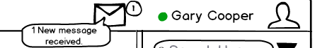
But why not display the same drop down list that the user would see on clicking the Notifications icon.
The reason is that the drop list is too big. Would you yourself like such a big popup coming up every now and then?
No. Right?
Coming back to the bubble, notice that the count of unread message has increased.
Lastly, we need to take into consideration that the user might not always be working in Kandan. The user may open up multiple browser tabs to complete different tasks.
So we also need to display the notification bubble once the user has navigated back to the browser tab having Kandan.
Final Thoughts on Designing the Notifications Feature
Ideally, I should have also provided a way for the user to dismiss the notifications. But I haven’t because that feature is not so important and also because we are designing the Minimum Viable Product, remember?
This completes the design of the Notifications feature.
I haven’t done anything earth shattering in this design. You will find this kind of design being implemented in many other places too, for example Facebook, Gmail etc.
So what do you think? Did you like what I designed?
Thoughts? Suggestions? Comments? Anything?
I would love to hear them in the Comments below.
Also, as always please do share this Kandan Redesign Case Study with your friends. It would mean a lot to me.
Hi Abhijit!
What was the reason behind putting the notification on top right area of screen? Is it just convention or is there some scientific reason behind it (like the Z or F scanning pattern?)
Why not top left?