Couple of days back I started the Kandan Redesign Project with the aim to design the Kandan web chat client right here in front of you step by step. That time we just discussed about the scope of the project.
Today I will walk you through the steps I took to design the home page of Kandan which I had named “Hall”.
Hall page is nothing but the landing/dashboard page which a user will see after logging in to Kandan.
Before I get down to that, let me quickly remind you about the scope of the Hall page.
Hall page should:
- Display List of all Public and Private Conversations,
- Display number of users involved in each Conversation,
- Display list of all users of the company and their statuses.
Also, for users, some of the things that I had scoped in were:
- Users should be able to create/delete/rename Conversations.
- They can participate in multiple Conversations at the same time.
- Should be able to send 1-1 Private Messages to each other without creating a Conversation. This can also be viewed as direct 1-1 Chat.
- Should be able to set their Status, for example: Available, Busy and Away.
If you are a bit lost about what I am talking, please read the Kandan Redesign Kick-off post.
Ok, now let us get down to the actual design process.
Minor Changes to Sacha’s Design
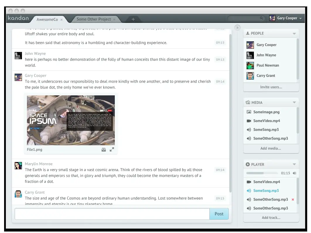
This Kandan redesign project is an off-shoot of Sacha Greif’s original design of Kandan’s core chat window.
If you don’t remember how Sacha’s design of the core chat window looked like, here it is once again:
I am about to design the Hall page, right?
So why am I talking about the core chat window?
Because a good web application design always tries to keep certain parts of the UI the same on all pages. Or at a minimum it tries to use certain parts of the UI for the same purposes across all pages even if the actual content in that region changes on every page.
Ok, I do agree that there is an exception to what I just said. Inconsistency can be useful in some cases. I will cover this interesting subject separately someday.
In this case, the top part of the core chat window which displays the tabs, search bar and the logged in user’s information is going to be the same on all pages.

The minor changes which I did were:
- Shift the image of the logged in user to the right of the name of the user so that I could accommodate the status icon on the left side of the name.
- Because the image has now moved to the right side of the name, I removed the small drop down arrow that was on the right side of the user’s name. The arrow was to bring up the menu to perform actions which the user can now bring up by clicking the image.
- Speaking of the menu, I added actions so that the user can set the status to Available, Away and Busy or just log out. This satisfies one scope item that is to let the users set the status.
Here is how the top part of the chat client looks now.
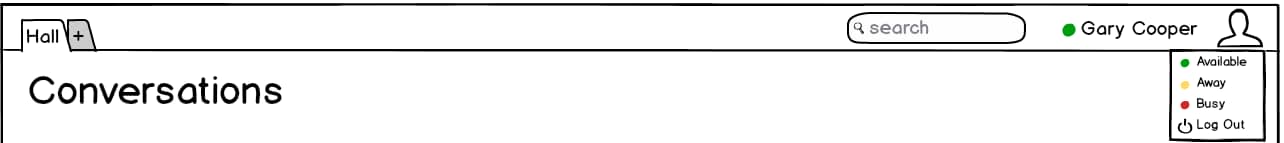
I have not changed the Tabs design even though I think the current version of Kandan has got rid of the tabs and instead it now has a vertical panel on the left side which lists the Channels (a.k.a Conversations) that the user is involved in. Note that I could not confirm the current design because the demo server is down.
So why did I not change the tab design?
It was because of the following reasons:
- If we put a left panel to display the Conversations that the user is involved in then we need to keep that left panel on almost all the pages which unnecessarily takes up considerable amount of space on the left side.
- Tabs design does not take up any additional space and can be put in the same horizontal space where the user’s logged in status is displayed.
- All users are used to working with browser tabs, so the concept of tabs is not unfamiliar.
You can put forward an argument that if the user opens too many tabs, the size of the tabs will get resized which will hide the name of the tab.
But then the same argument can be made for displaying the name of the Conversations in the left pane. What if the user gets involved in too many Conversations? That would result in a vertical scroll bar which will effectively hide some of the Conversations apart from not looking so good.
Also, do you really think a user would actively participate in 20 Conversations at the same time? I doubt that. Such users will be in minority.
It’s always good to design web applications around user use-cases rather than the UI real estate that you have.
Designing the Users Panel
Remember the third point in the scope of the Hall page about displaying the list of all users of the company and their statuses?
I had said earlier that I wasn’t fully convinced with the usefulness of this feature.
I debated a lot with myself if I really need to include this. And then I finally decided to include it in the design because there was a point in the scope of a user that all users should be able to send private messages to other users. Similar to 1-1 chat.
Having the panel of users on the right would satisfy that point of the scope too.
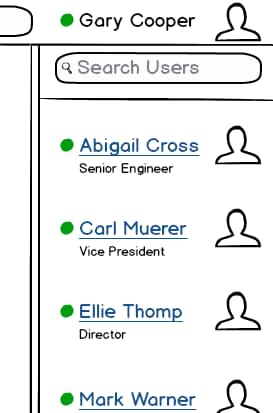
So I added the Users panel on the right side. Here is how the UI looked.

The list of users will be sorted by their status as mentioned below:
- Available users will be on top arranged alphabetically by their names,
- Followed by Away users arranged alphabetically by their names,
- This will be followed by Busy users again arranged alphabetically and finally
- Offline users will be displayed again arranged alphabetically by name.
If a user clicks the name of any user in the right panel list a new tab will open up having the name of the user as the title of that tab.

From that tab the user will be able to send a private message to the other user.
I will design the contents of that tab at a later point in time.
But my initial concern about how to display a large number of users in this right panel was still lingering on my mind.
I could potentially put a vertical scroll bar in the panel. But do you think that design will scale if there are thousands of users? No, it won’t.
You should always take into account the volume of data to be displayed while designing web applications.
So I decided to just show around 10 users in the right panel. There will be no vertical scroll bar. But the vertical scroll bar would get displayed depending on the resolution of the screen.
The next question was then how to let the user search for other users who don’t show up in the list. The answer was to provide a search box on top of the panel.
Any user can just type in the name of the user he is searching for and the list would get refreshed simultaneously. Here is the updated design.
Next I thought it would be great if I could also let the user sort the users list by name and hide the pictures of the users so that panel can display more number of users.
So I slightly tweaked the search bar in Users panel to include a drop down menu containing these actions.
Here is how the final UI of the Users panel looks like.

I know you will be wondering, what’s the use of having the top search panel that is right besides the logged in user’s name? I will come to that search box later on. For now, let us keep moving ahead with the design of the actual Hall tab.
Designing the Hall Tab
Now, let us get down to the design of the core Hall tab contents.
If you remember, the first 2 requirements in the scope of the Hall design were that the Hall page should:
- Display List of all Public and Private Conversations,
- Display number of users involved in each Conversation,
While the scope of the users had a requirement that users should be able to create/delete/rename Conversations.
Here is what I did to fulfill these scope items.
To display the list of all conversations I started with the use of a table. And here is how the design looked like.
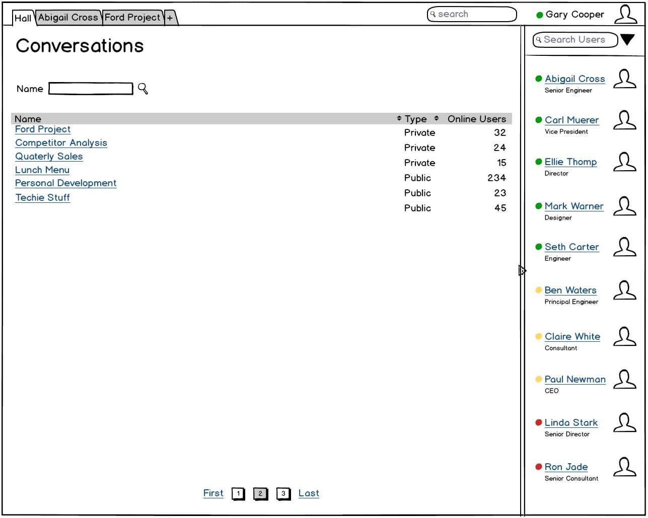
I put a search field for Name of the Conversation at the top followed by the table.
The table has just 3 columns, Name of the Conversation, its Type – Private or Public and Number of online users. The table will be sorted on Type column because I think most of the users would eventually end up spending more time in Private Conversations than in Public.
The table would display at a maximum 25 rows followed by pagination bar at the bottom. Vertical scroll bar would get displayed as needed depending on the resolution of the screen.
The Name of the Conversation would be a link clicking which will open the core chat window as a separate tab.
Though the design looked good, I was still not satisfied with the look and feel of it.
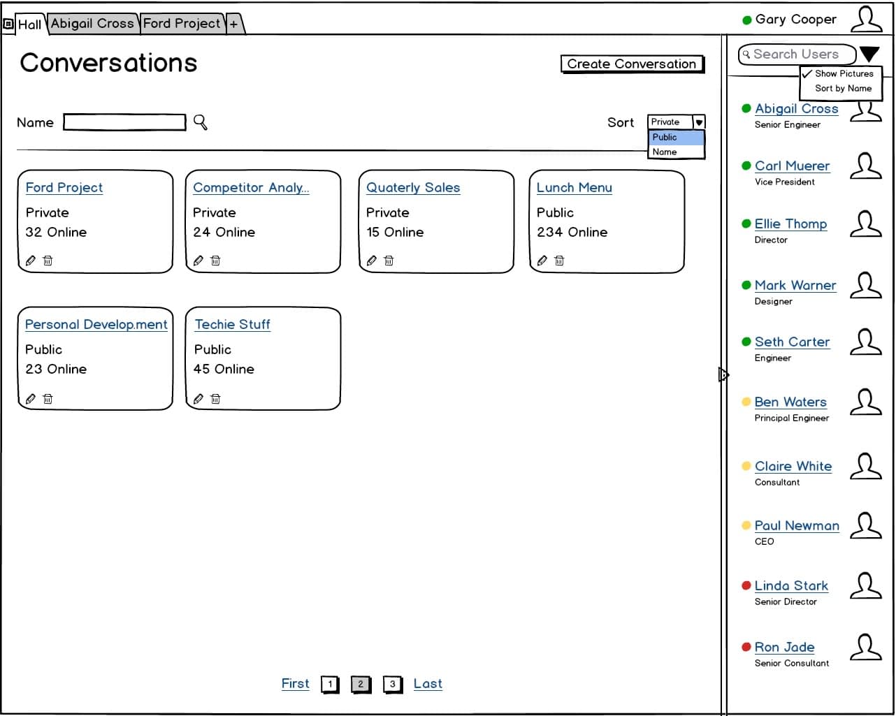
So I decided to use the deck layout instead. Deck layout is nothing but using cards to represent the data from the rows of the table.
The result was the following design.

I think with a good color palette we can really make the card design to stand out. For inspiration you can read this article.
The only addition I did to this layout was to add the Sort drop down which will let the users sort the cards based on name or type (private or public). By default the cards will be sorted on Private type.
Now, the next thing left was to add the actions to create, edit and delete the Conversations.
I added a prominent button on the top of the tab to create a Conversation and the icons to invoke the edit and delete actions on each card.
This is how the final design of the Hall page looks like.
I will cover the design of the Create, Edit and Delete Conversation windows separately as its design needs more thought.
You will notice that I have made couple of more modifications to the top horizontal bar.
One, I have put a small 16 x 16 logo placeholder right before the tabs so that companies can brand their Kandan clients.

And two, I have got rid of the top Search box. As of today, I have taken the decision to remove the top search bar because we have anyways added search boxes on the Hall page and inside the Users panel on the right. If needed, I might revisit this decision, to remove the top search box, in future as I move ahead with the design of the other features of Kandan.
But as of today, I have decided to get rid of that top search box.
A Quick Word on Wireframing
You must be wondering when I am going to create a high fidelity wireframe or prototype.
No, I am not going to do that.
I know many of us designers like to create an exact replica of the actual web application. But that is not really needed always.
A basic bare bones wireframe which is able to convey the design idea to the developers is more than enough in many cases.
The actual styling of the UI can eventually be done by a graphic designer after the design is finalized.
There is no limit to the imagination when it comes to colors. So don’t bother about them till you have finished designing all the features.
Keeping Track of Progress
Just to keep things on track, today we have completed the following design features:
Hall page:
- Now displays a list of all Public and Private Conversations,
- Displays number of users involved in each Conversation,
- Displays list of all users of the company and their statuses.
Users:
- Will now be able to create/delete/rename Conversations.
- Can now participate in multiple Conversations at the same time.
- Will be able to send 1-1 Private Messages to each other without creating a Conversation.
- Will be able to set their Status, for example: Available, Busy and Away.
So what do you think?
Is there anything I could have done differently? Or is there anything I might have missed out? Let me know in the comments below or I am just an email away 🙂
In the next article I will go through the steps I took for designing the Create/Edit and Delete Conversation features.
I thank you for taking time to read this. If you think this might be of interest to anyone that you know, please share this project with them. I will really appreciate that.