I am not a big fan of Inline Edit design pattern in web applications….you will see why shortly!
Inline Edit pattern enables users to edit text directly on the same page instead of navigating them to another page for editing the text.
There are various ways in which you can design the UI inline edit feature and I will discuss many of those today.
Basically, you can design inline edit feature in the following 4 ways:
- Single Field Inline Edit
- Inline Edit in Popup
- Inline Edit in Popover and
- Multiple Fields Inline Edit
Let us discuss all of them one by one.
Single Field Inline Edit Design
You can see this design in action on Apple iCloud while editing any Pages document in a browser.
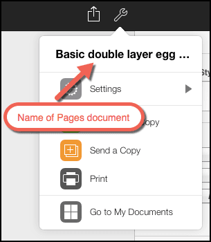
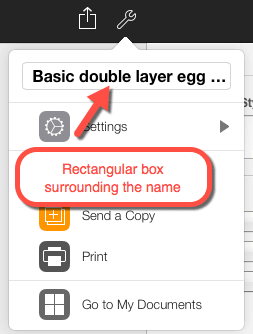
The above image shows the name of the Pages document “Basic double layer egg…”. To rename this document to something else, you can hover your cursor over the name. Once you hover over the name, you will see the name getting enclosed inside a rectangular box as shown below:
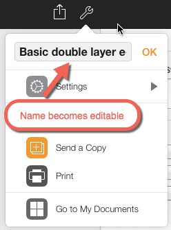
This just indicates, that the name can be edited. Once you click inside the rectangular box, the name becomes editable and you can type anything in it to rename the Pages document.
It does look a clean approach without too many UI elements. But discoverability is a big issue in this design.
How do you think the users are going to discover that the name field will become editable once you click inside it? Not without someone telling them or them accidentally discovering it.
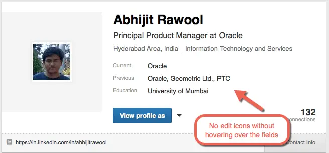
Linkedin overcomes this problem by prominently displaying the Edit icons once you hover over the fields.
![]()
But still the users have to hover their cursor over the field. Without hovering over the fields, the edit icons are not visible.
Now, look at the above image and tell me how the users are going to find out that the fields can be edited? They cannot. Again they have to accidentally stumble upon it or someone has to tell them.
Tumblr over comes this problem by always displaying the edit icons. You don’t have to hover over any fields to see the edit icons.
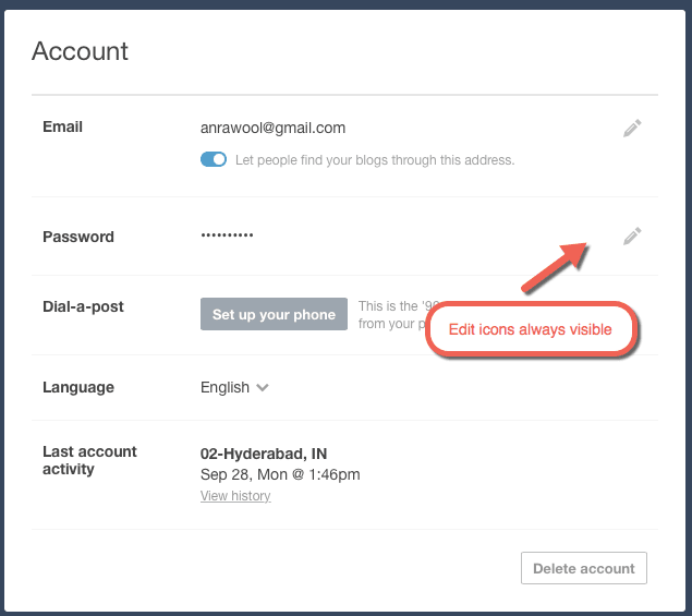
Now suddenly discoverability is not that big an issue. But this does pose a problem when there are too many fields to edit. The UI is obviously going to look cluttered.
Clickbank overcomes this by giving just one Edit link at the top of every region displaying a group of fields.
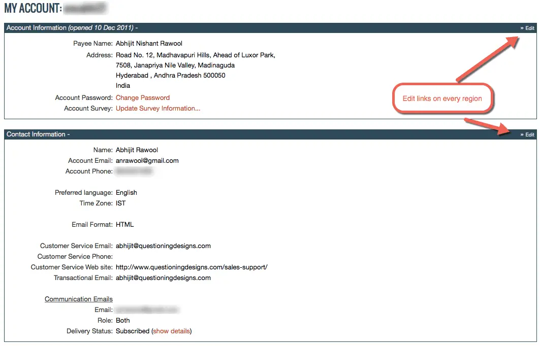
Still not a clean solution but it does get rid of the concern of cluttering the UI with too many Edit icons.
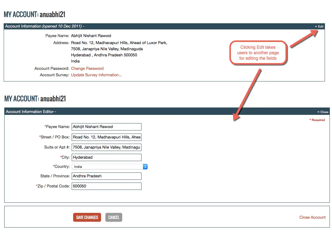
Now here’s the question. Instead of doing all of this why not just provide one prominent Edit button on the top of the page? Something like this:
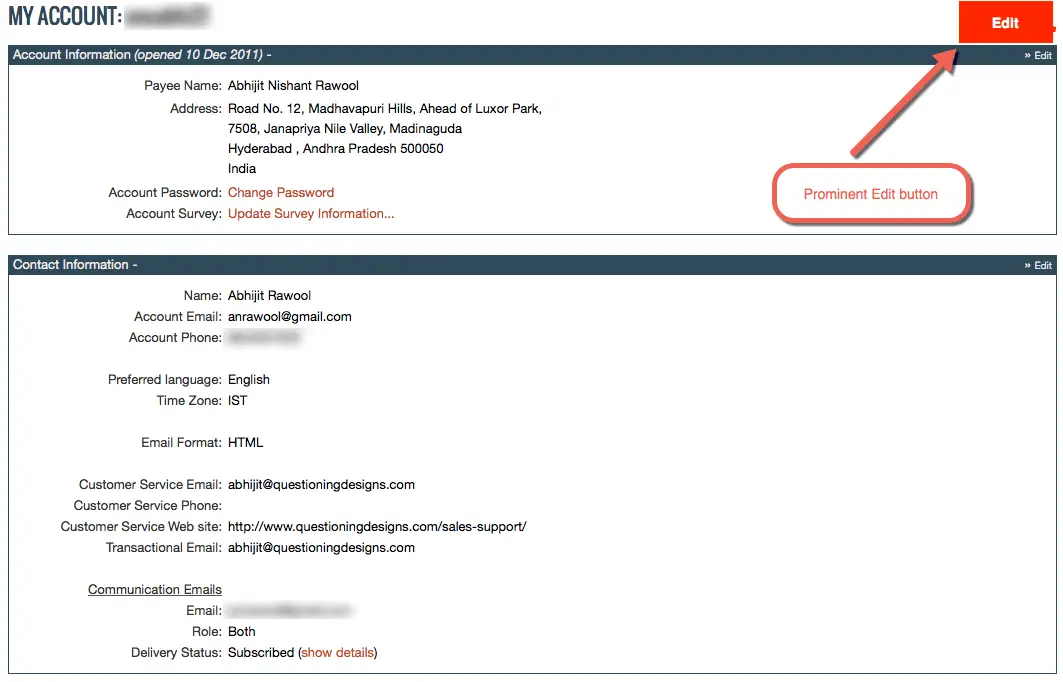
Doesn’t this make things a lot more clear?
Yes, it does mean that every region will become editable at the same time. But does this make a difference? Will it confuse the users? I don’t think so.
I know that the biggest argument against this design is that the there is a friction when the page shifts from View mode to Edit mode. It does not give a very good user experience.
But does it not make things clear to the users?
Sometimes clarity is more important than worrying about superficial UI friction issues.
Now you know why I don’t like Inline Edit patterns too much. But let us stick to the point and see other ways in which we can design Inline Edit feature.
Inline Edit in Popup
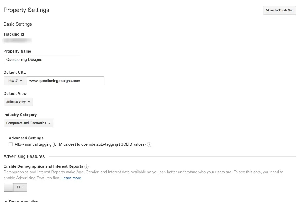
Google Analytics uses this design. If you click the Edit icon on any of the regions on the dashboard, you get a popup with all the editable fields.
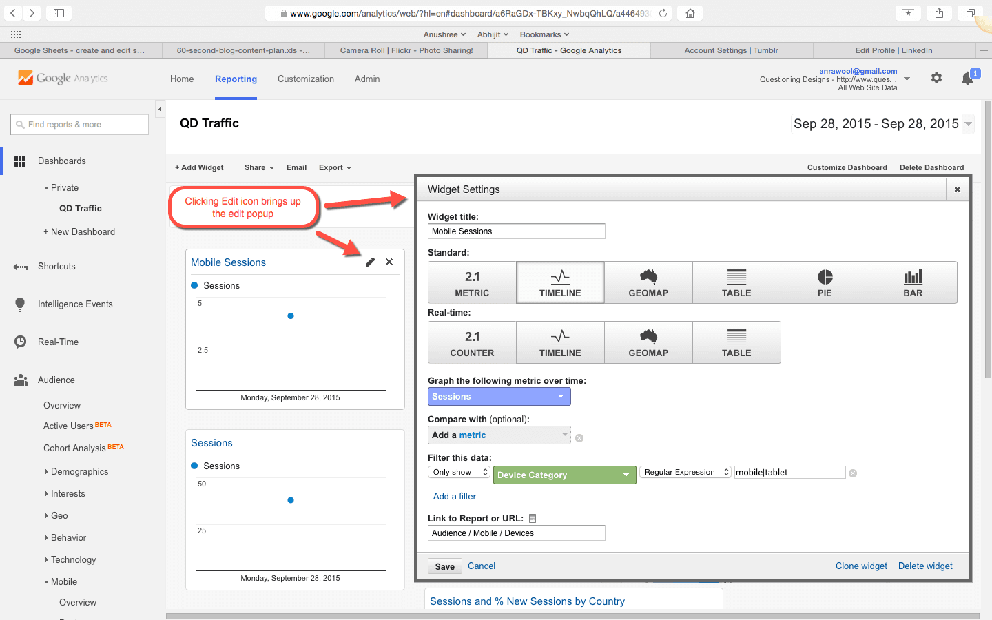
This is one way of letting the users edit the fields without navigating them to another page.
This approach works well if there are too many fields to edit. It won’t look nice if the number of editable fields are too less.
This is where the next design approach comes in.
Inline Edit in Popover
Linkedin is a very good example of this design. Once you click on the Edit icon, a small popover appears in which you can edit the fields.
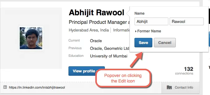
There are Save and Cancel buttons that clearly indicate the next actions that the users can take.
Tumblr does something even subtler. Once you click the edit button, only those particular fields become editable and the rest of the fields fade out in the background.
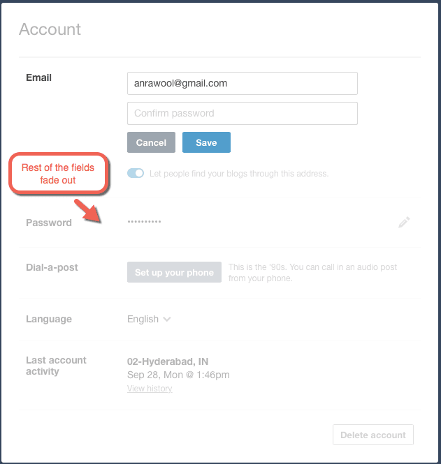
Again there are prominent Save and Cancel buttons to clearly indicate the next actions.
These types of designs are good if you are editing small number of fields. But what if you want to let the users edit too many fields?
Either you can launch a popup as Google Analytics does or implement something like the next design approach.
Multiple Fields Inline Edit
You will see this design in action on Linkedin. If you click on any of the Edit icons while you are editing your Education details on your profile, the entire region will get replaced with editable fields.
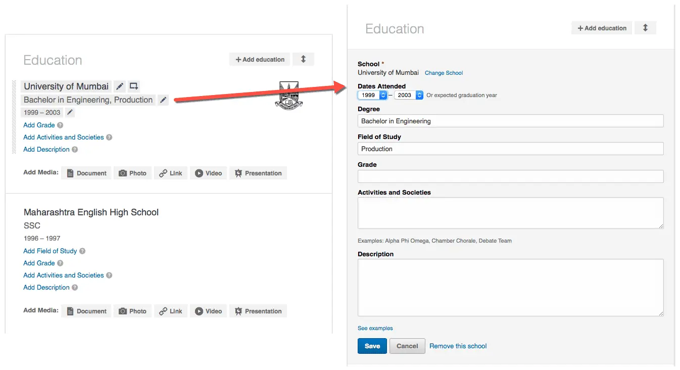
Again the Save and Cancel buttons are prominent to take the users to the next action.
This is a good approach take if you are hell bent on keeping the users on the same page.
Clickbank does not follow this kind of inline edit. Once you click Edit on any of the regions, you are taken to another page where you can edit the fields.
Clicking Save will bring you back to the original page.
The purist UX advocates will hate this kind of design. I have heard this argument over and over again that this does not deliver a good user experience.
Personally I think most of these arguments stem from the fact that the people designing these UIs are not really aware of their users or the tasks they are trying to accomplish within the web application.
If your users are going to be individuals whose thought process might break if you navigate them to another page then sure this design is a problem. This can happen if the task that they are trying to do is complex. Filing Income Tax at the end of the year comes to my mind readily 🙂
But if you are designing for people who are going to well aware of the work they are trying to get done from the web application then this kind of design is not that big a problem.
Aesthetically it does not look good. I agree. But if it lets the users do what they want to do without confusing them then I don’t see a reason why you cannot design something like this.
The questions that I think we need to ask while designing such UIs are:
- Whether this kind of design will be confusing to the users?
- Will it be clear what part of the page they are editing?
- Will they need to refer to the other fields on the main page?
- Does this break their chain of thoughts while editing the fields?
If you know your users well, then you should be able to answer all of the above questions.
But there are still better ways to design such UIs.
Edit Mode Always On
Google Analytics uses this approach on some of their pages.
As you can see there is no View mode of the page. All the fields are always editable. Now there is no confusion of what can be edited, no need to discover anything and no so called friction.
Just change the values and save your changes. Simple.
I have seen this kind of design approach in most of the Enterprise Web Applications. The reason for this is primarily because the users who use such web applications spend most of the time editing things rather than reading. So pages in View modes are not that necessary.
However, you cannot implement such a design if the primary purpose of your web application is to show data to the users or make them read the data. Web Application catering to generation of various reports are an example of this.
My Preference
I am a little biased towards showing the Edit mode always. Particularly in web applications that are meant to let the users enter the data, like business web applications.
But if the web application is supposed to display data to either the business users or other normal people then it is hard to avoid the View mode. In this case, you can take inspiration from all the UI designs that we just saw.
What’s Your Preference?
What do you think? Is there any other Inline Edit design that you have seen?
I would love to hear about it in the comments below.
Finally, don’t forget to share the article if you liked it 🙂
This is an awesome article about the topic! It was extremely helpful for me, even if I didn’t find exact answer to question I had… The challenge I faced in my work: we pre-generate a title based on an information provided by a user during previous step, however, there is part of the title that could be editable. So I need to make only part of my field editable, at the same time it’s nice to show preview of the whole title. Right now I have two fields: one is pre-generated title, another is editable field. When a user changes the value of the second one we’re updating preview in real time. We haven’t performed user testing on that yet. Fortunately, there are only few fields on that screen so it shouldn’t be confusing.
I am glad you found the article useful. Regarding the partly editable Title, have you checked how WordPress handles editing the URL of a page that the user is creating? It seams like you are handling a similar case. Basically what it does is, say the URL of a page being created by the user is http://example.com/my-page then WordPress allows the user to edit the “my-page” part of the URL. And the way it does that is by giving an “Edit” button right near the end of the URL. When the user clicks the Edit button, only the “my-page” part becomes editable in a text-box and “Save” and “Cancel” buttons replace the “Edit” button. In the edit mode, the user can change “my-page” part to say “new-page” and then click the Save button to save the new URL or click Cancel button to undo the edits.
I’m glad I found this article. It has a nice discussion about inline editing.
I have the same problem but at a next level: inline table editing. So if inline editing can be ugly, inline editing in a table looks worst.
I think everything should be crystal clear for the end user. So I’m in favor of fields with their box so nobody has to guess interactions. Even more, it brings consistency to your system, less memory load on the user side, there are many points that make ugliness look awesome and for good reasons.
Also we have to think about save. If I click in a edit to enter in a edit mode I need a save action. But if I do a quick inline edit, do I need to save? will it autosave? will my user detect any of them? There is lot of uncertainty in this topic.
Hi Victor,
Yeah, inline editing in a table is a bit more complex to handle. Probably I will write on this topic separately.
I am working on an inline editing in a table right now as well, if you do write a separate piece on this I would love to read it. Thanks!
Jess, I will definitely write on inline editing in tables. Probably next week.
For inline table edits I prefer “click to edit” fields. A pointer over text can be enough to tell the user they can click on it. Turn simple text into input, autosave on enter or “blur”.
That only applies mostly for “tech savy” users though, many people can mistakenly make unwanted changes.
A workaround I found to work in a good way was displaying a popover when the user clicks on a field, then changes can be made and saved by the user or discarded.
Excellent points Alan. I have even seen double-click-to-edit implemented in some tables where users need to double-click a table row to edit it. This is specifically useful when some row level actions are to be allowed on the selected row. The first click would select the row and users can take any of the available row-level actions, like duplicate. The second click would make the row editable.
I’m working on inline editing in a table. In my case I have a number that needs to be edited. I went with a link that describes what needs to happen which triggers a modal. I’m second guessing myself now as I want to be consistent should I need to implement this around the app later. I’m trying to think about other edge cases
Very nice article actually, I’m also not a big fan of the Inline Edit Feature, But I still didn’t figure out, what is the best solution for the mobile apps?
From the back-end inline edit is preferred because this means a tiny HTTP PATCH AJAX call every time a field change is committed instead of a larger HTTP PUT call when submitting content changes.
In addition, depending on approach, some fields may be editable but not all of them unless the user has sufficient entitlements in the application.
Understanding where and when to use inline edit vs always on edit is also important for consistency.
I’m not sure whether I prefer the pure inline or the popover. I’ll need to play with the options and see which feels best. I may lean to popover because the user takes defined action to commit the changes and sometimes may start an edit and need to abandon it partway through, where pure inline could lead to accidental committed changes.
Anyway, nice writeup. It’s given me some additional context and patterns to consider.