
Yesterday I stumbled upon an article by Paul Boag in which he discussed about how small things can make big differences in design by giving an example of how to design the Country picker drop-down. The point being addressed was the display of large number of countries in a drop-down.
Drop-down lists are good enough if you have less number of items to show up in them. But if you have to display a large number of items inside the drop-down, like a list of countries, then the drop-down becomes a nightmare for both the designer and the user.
Scrolling through such a big list is such a bad experience. For example take a look at this drop-down list of Bus Boarding Points on goibibo.com
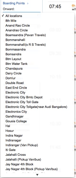
Not good, isn’t it? And to make matters worse that drop-down is provided in the Faceted search region.
Drop-downs have also been categorically described as bad for user experience by many people.
So, is there a better way to design drop-downs?
I think there is.
Designing the Drop-drop Field for Large Number of Items
I came across another article which took a stab at improving the user experience of the Country picker drop-down.
The solution was to convert the drop-down into a text-box and then let the user type in the name of the country. As the user typed in the name of the country, a list of possible countries would be suggested.
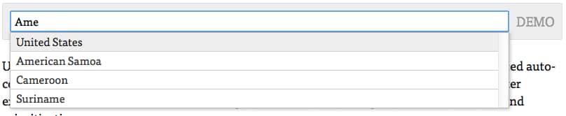
You can take a look at the live demo of this over here.
This design took lot of things into consideration to create a custom logic for displaying the list of countries. Like, what if the user types in United States vs US vs America , in what sequence to display the countries and so on.
But this solves the problem only if the drop-down is to list countries. What if it is to list say, currencies or names of suppliers or warehouse codes?
This approach will simply not work. You cannot keep on developing custom logic for each and every drop-down that you design.
Furthermore, if you are designing web applications then chances are you will have drop-downs for many different things with each of them containing a large list of values.
And to aggravate the problem, the number of values in many of the drop-downs may keep on growing as the web application is being used.
For example, say you are designing a web application that is to be used by businesses for maintaining the products being supplied by its suppliers. On one of the pages of the web application there is a drop-down displaying the list of suppliers. As the business grows and adds more and more suppliers, that list is only going to grow.
Imagine showing a list of 1000 suppliers in that drop-down 🙂
Kills the user experience, isn’t it?
So, what to do?
The answer is quite simple. We need to let the user search for the supplier.
But can we do this in a drop-down?
Off-course we can. Here are two ways of achieving this.
Provide a Search Box Inside the Drop-Down
One way to let the user search the list of suppliers is by providing a search box at the top for drop-down. Something as shown below:
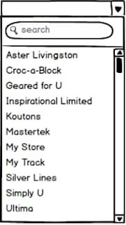
As the user types in, we can narrow down the list of suppliers.
But this design has a flaw.
For the search to execute, we need to load all the values into that drop-down, which means we need to fetch all the suppliers from the database and load them in the drop-down first. Not a good technical design.
However this approach may work well if the list of values to be displayed is going to remain static and not grow over time. For example say, a drop-down that has to display a list of 100 Category Codes of a Product.
Provide a Search Popup from Inside the Drop-Down
To overcome the limitation of the above design, that is if the number of values are going to grow over time, you can display say only 10 values and then put a Search link at the end of the drop-down. Clicking that link will bring up a popup in which the user can search for the supplier. Something as shown below:
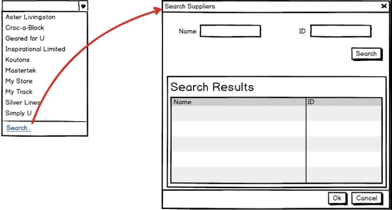
After searching and selecting a supplier, the user can click the Ok button to close the popup and return to the drop-down with the value selected in it.
Now you are not required to load all the thousands of supplier names in the drop-down before the user can search for anything.
You can further refine this design by letting the user type in the search value directly inside the drop-down field. Something like this:
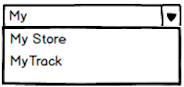
You can then auto-suggest a list of possible values.
However, you still let the users use the drop-down list to quickly select a value instead of typing it in.
Let us refine this design a bit more.
Remembering the Most Recently Used Values
In a web application, a user is expected to perform a task over and over again. For example, in the above Supplier application, say the user is expected to keep raising orders on the suppliers every-day.
So you do not want the user to keep searching for the same supplier every single time?
The application should remember the suppliers that were recently selected by the user and then display those at the top of the list. Something like this:
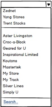
This way the user doesn’t have to keep searching for the same supplier over and over again.
You can decide the number of most recently used values to display at the top. I would say 3 is a good number.
This brings up another question. Should we display the most recently used or the most frequently used value in the drop-down?
I prefer to go with the most recently used. Reason being, what is most frequently used value today might not remain so tomorrow. So you don’t want to keep showing the old value till the new one becomes the most frequently used.
Is this Still a Drop-down?
Ok, I do agree that I have broken the conventional definition of a drop-down by introducing a Search feature.
But doesn’t the entire premise of selecting a value from a list of values remain the same?
I guess it does.
Over to You
What do you think? Can you think of any other ideas to make the design of the drop-down better?
I would love to hear your ideas in the comments below.
And if you liked what I wrote, do help me to spread the word by sharing this article with your friends.
> Should we display the most recently used or the most frequently used value in the drop-down?
Why not both? I’m looking for a function that can find the most probable items the user might pick, based on previous selections. It should bring to the top items that have often been used in the past but not necessarily recently, and also items that were used recently but not necessarily very often.