Drag and Drop is a common feature these days. Whether it’s a desktop application or a web application, you will see implementations of drag and drop everywhere.
But not everyone implements it properly.
There are many people who design their drag and drop feature the wrong way. It not only confuses the users but also makes them frustrated.
Drag and drop is not very intuitive by nature. But if designed properly it can be a good feature to have.
Here are some design considerations that you need to keep in mind while designing the drag and drop feature.
Hinting Drag and Drop is Possible
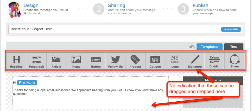
I have seen many web applications that just do not tell the users that drag and drop is possible. For example, have a look at this interface from Aweber:
While composing an email in Aweber, user can drag and drop various elements onto the email template. But there is absolutely no indication of that. The only indication of the possibility of drag and drop that is shown to the user is in the tooltip of each of the icons once the user has hovered the mouse over them.
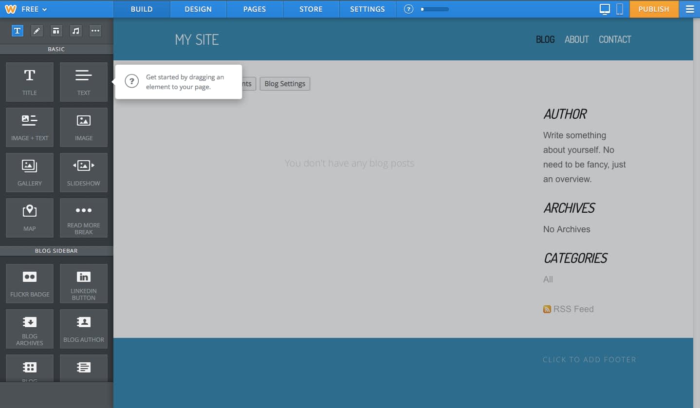
On the contrary, Weebly clearly lets the user know that drag and drop of the various elements is possible when the user is building his website or blog.
Though Weebly shows it in the form of a tutorial, you can think of displaying it always as a static text somewhere within the region like WordPress does it while uploading files.
Always remember to indicate to the user that drag and drop is possible.
Indicating the Drop Zone
It is very essential to let the user know where the element being dragged is going to be dropped, the target location.
There are couple of ways in which you can indicate the target location to the user.
1. Display Placeholder Target Location
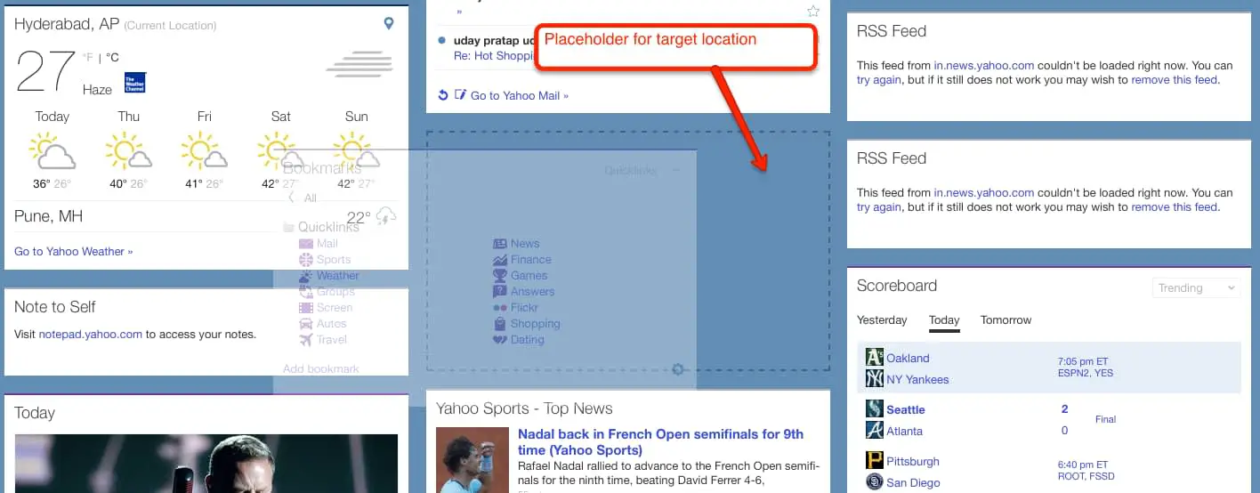
Once the user has started dragging the element, you can display a placeholder location where the element can be dropped.
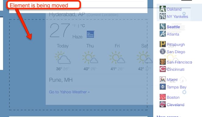
My Yahoo does that by displaying a placeholder location with dotted lines.
This way the user gets the idea of where the element can be placed.
2. Display Placement Point
You can also think of displaying the point where the element is going to be placed.
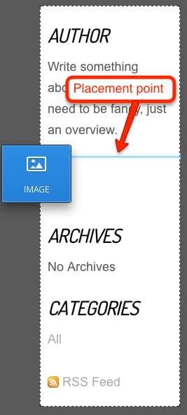
For example, Weebly shows a thin blue line where the element is going to be placed.
This design helps when the element being dragged is bigger in size. With the previous placeholder design approach, a large area on the interface would have got displayed as placeholder. The placement point design approach helps us to avoid that.
A Note on Target Locations
One thing to note in both the design approaches is that the elements below the target location have to move down to accommodate the element being dropped.
This causes a lot of visual noise.
One way to avoid this is to display a horizontal placement line, similar to what Weebly does, but without moving the below regions. The below regions would get moved once the element is dropped at the target location not before that.
Dragging Effect
Once the user has started dragging the element, you should indicate in some way that the element is indeed being dragged.
This can be easily achieved by displaying the element alongside the cursor. For example, My Yahoo does it by displaying a transparent image of the element being dragged.
This way the user gets to know that the element is indeed being dragged.
Drag Distance
One of the biggest concerns with implementing drag and drop feature comes when the distance between the current and target location is big.
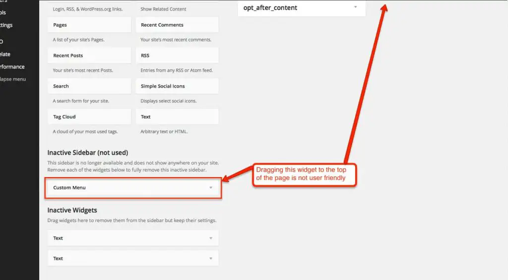
For example, in WordPress, if you have too many widgets, then dragging one from the bottom of the page to the top of the page is very tedious.
Always try to keep the current and target locations near-by because it is very difficult to scroll up or down the page while holding the element being dragged.
Move vs Copy
Drag and Drop feature can be used for either moving an element or for copying an element.
If you are designing drag and drop to move an element, then the current location should become empty once the user has started dragging the element.
My Yahoo does this by showing a placeholder in the current location.
This visually tells the user that the element is being moved.
But if you want to let the user copy an element from one location to another, then you need to keep the element in the current location as well as display the transparent image alongside the cursor once the user has started dragging the element.
Aweber has implemented this design.
The user can easily see that the Signature element is being copied from the original location.
Accessibility Design
Drag and Drop is the worst feature for accessibility. So you need to provide an alternate action for drag and drop that the user can invoke.
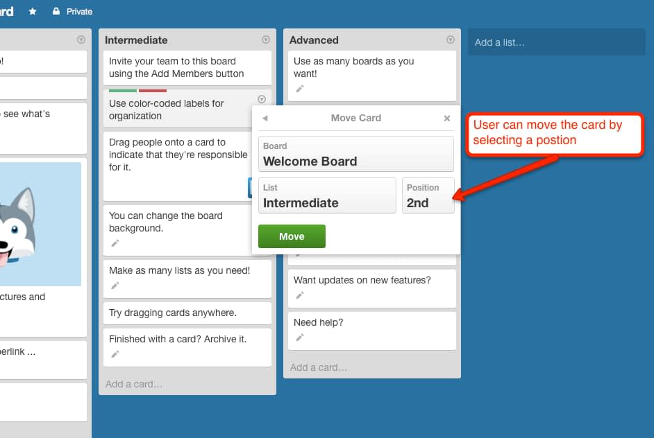
Trello provides a Move action for each of the cards that can be dragged and dropped within the Lists.
The user can easily set the Position of the element and click the Move button to move the card in the specified position.
Areas to Implement Drag and Drop
Drag and drop is one feature that can be implemented in many different cases.
You can use drag and drop feature to let the user move around certain regions of the user interface or you can also let the user move rows of a table up and down.
You can also let the user drag a node of one hierarchical tree and drop it on another hierarchical tree or from one hierarchical tree to a flat table.
Further you can let the users drag an object from one place to another. For example, for an e-commerce store, you can let the user drag an item to the shopping cart.
I am sure you can think of many other interesting implementations of drag and drop.
What Do You Think?
If you keep the above design considerations in mind, I think you can design a user-friendly drag and drop feature.
What do you think?
Is there anything that I have missed? I would love to hear it in the comments below.
And as always, if this article has helped you in anyway then please do share it with your friends. I would really appreciate that.

