Couple of weeks back, I was using Google Adwords for finding topics to write on User Experience. And ironically, I stumbled upon a User Experience issue in the Adwords interface.
For those of you who don’t know what Google Adwords is, it is a web application by Google that allows you to buy ads on the Google network.
And for doing so, Google gives you some useful tools so that you can research words on which you may want to place a bid for your ad. One of such tools is the Keyword Planner.
I wasn’t trying to buy an ad. I was merely searching for some words around User Experience on which I can write an article.
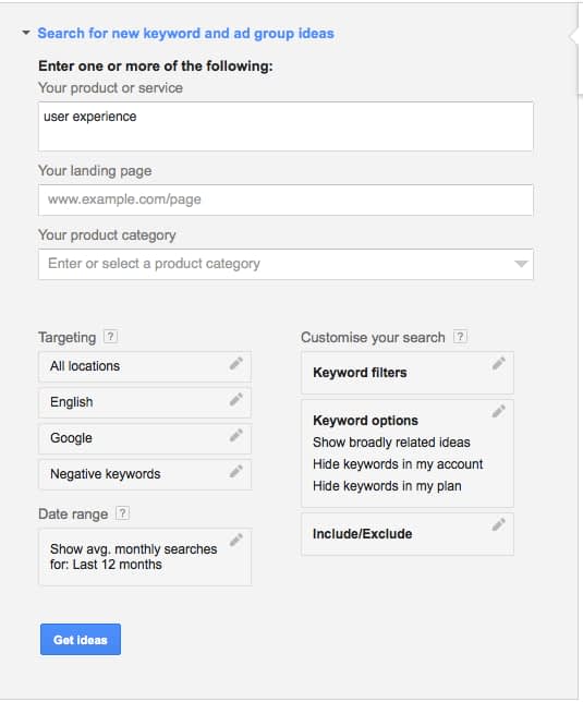
While using the Keywords Planners tool, I was trying to set Keywords Filters so that I can see only those words which were searched for more than 100 times a month on Google.
Here is how the interface looked like.
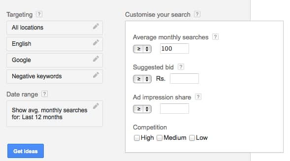
On clicking the Keywords Filter field, I got a popup (can we call it a popup?) as shown below:
After entering 100 for Average Monthly Searches field, I was trying to close the popup.
But there was no “Ok” or “Apply” button!
I even hit Enter key couple of times. But no use. That popup just wouldn’t close.
Then it hit me. I need to click somewhere outside of that popup.
And once I did so, the popup closed 🙂
Wow, so much for the User Experience!
Why Did Google Design a Buttonless Popup?
Frankly, I have no idea.
I thought long and hard, why Google might have designed such an interface. But I cannot think of any logical reason.
Ok, I do agree that the interface is not that of a typical popup. But still it resembles and behaves so much like a popup.
I also tried to think of cases, where I can implement such a design. But again, I couldn’t come up with an answer.
Did Google tried to save some UI screen space which otherwise would have been used up by the buttons?
Maybe. But the overall user experience beats this small saving.
Did Google try to save one mouse click?
Apparently not, because you still have to click outside the popup to close it.
Enhancing the User Experience (A Little Bit)
If a buttonless popup was absolutely essential, then atleast it should be designed to close on hitting the Enter key.
I agree it is not an optimal solution but it is definitely better than clicking outside.
The optimal solution would off-course be to use “Ok” and “Cancel” buttons.
Your Views?
Can you think of any reason why Google might have designed such an interface?
Or can you think of any other way of improving the user experience of this buttonless popup?
I would love to hear your views in the comments below.
And as always, please do not forget to share this article with your friends. Maybe someone will be able to figure out the logic behind this buttonless popup.


