Search is an important component of any web application.
A good search feature can really boost the usability of a web application. So it is very essential that you invest a good amount of time in designing your search box.
Essentially the search box is just a text box field with a button adjacent to it so that one can carry out the search. You can style the search box in a number of ways. Have a look at this Smashing Magazine article which goes in great depth on the various ways of styling the search box.
Apart from styling the search box, you can get really innovative in how you design the overall interaction with your search box.
Today we will look at an innovative implementation of the search box.
But before we do that let me make one thing clear. Some of the web applications use a single search box for allowing the users to perform a quick search while some applications implement a full blown advanced search for allowing the users to search on various parameters at once.
For the purposes of this article we will only concentrate on the single search box design.
Common Way of Designing the Search Box
The 2 common steps which you will perform while designing the search box is to:
- Style it and
- Place it on the page.
Most of the web applications have a fixed location where the search box is placed.
That location can be anywhere depending on the layout of the page and how important the search is for your web application.
If search is very essential, then you can place it prominently on the top of the page like Google does it on their search results page and Facebook does it on the wall.
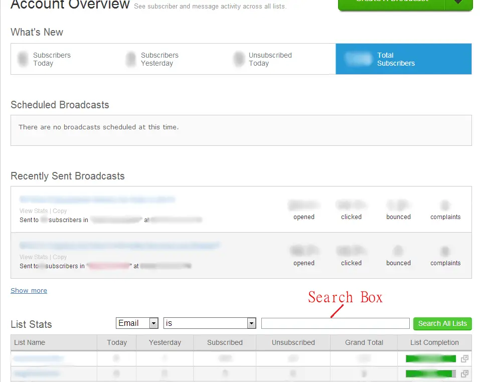
If search is something which is important but not the most essential feature of your application then you can place it somewhere else on your page. For example, Aweber places it way below on the page.
An Innovative Approach to Search Box Design
For some web applications like an Ecommerce site, search is something which is extremely essential.
Without a good search feature and a prominent placement of the search box, Ecommerce sites will have a very difficult selling anything to their visitors.
That is the reason why Amazon places the search box right on the top center of their page and so does EBay.
Both of these sites have implemented the search box similar to how Google has done it.
You can quickly type in what you want to search for and you will get a bunch of results.
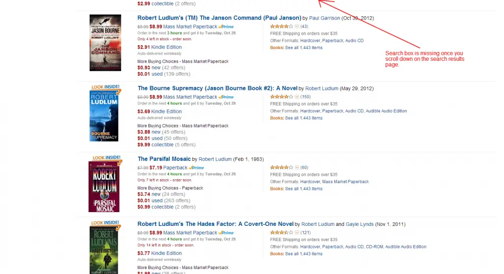
However as you scroll down on the search results page, the search box disappears as it is located at the top of the page.
So to search for something else, we now have to scroll all the way back to the top.
This is where Flipkart innovated.
To those who have not heard of Flipkart, it’s an Ecommerce site catering primarily to Indian customers.
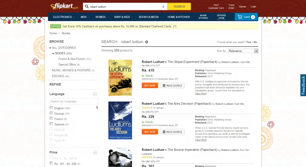
When you land on Flipkart’s homepage, you will find the search box right at the top center position similar to Amazon and EBay.
Below this box you will find a menu bar listing the shopping categories.
Now type in something and search to land on the search results page.
I entered the name of one of my favorite authors Robert Ludlum and hit search. I was taken to the search results page which listed all the books written by him.
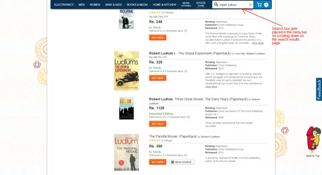
When I started to scroll down the entire menu bar floated to remain on top. And what was interesting was that the search box now appeared inside the menu bar on the right hand side and it contained the search term I had searched for “Robert Ludlum”.
So now I don’t have to scroll all the way to top for searching anything else. I can just search it from where I am on the page.
You might be wondering if this small little feature makes any difference.
According to ClickTale’s Scrolling Research Report, a visitor’s attention is at its peak on the top of the page and then diminishes as the visitor scrolls down the page.
So in case of Ecommerce sites, once the visitor has scrolled down and lost attention, the next logical thing to do for the visitor is to refine the search and try again or exit the site.
If at that instance the search box is readily visible then it becomes very easy to search with a different term.
This is why I think Flipkart’s search box design is so very good.
Can this design boost their business? Don’t know. Only Flipkart can answer this question.
This design also emphasis the point that the feature which is really useful for the users should always be visible to them. You don’t have to have a fixed rigid layout in your application.
Innovate if it helps your users.
Have you seen any other innovative search box design? Do let me know in the comments below.


