As a child, I remember playing a game called Name, Place, Animal, Thing. It involved a few players where they had to write a Name, Place, Animal, and Thing starting from a particular alphabet. Everyone had a paper where they would scribble, and the result would look something like a table.
| Alphabet | Name | Place | Animal | Thing | Marks |
| B | Bonnie | Bolivia | Bat | Bicycle | 40 |
| L | Leah | London | Lion | Lipstick | 30 |
| M | Meghan | Manchester | Meerkat | Mat | 40 |
| S | Soma | Spain | Scorpion | Sugar | 30 |
| F | Fiona | Finlad | – | Fan | 30 |
| O | Olivia | Oslo | Ox | Olive | 40 |
I guess if you also played this game, you would have recalled it by now. You must be wondering how this game is related to today’s post on the Master-Detail UI Pattern.
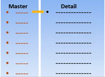
For the uninitiated, a master-detail UI pattern is a design interface mainly used to present the list of items and their details. If you observe, in this table, the alphabets are the list of items and their corresponding details are the name, place, animal, and thing. In short, alphabets are master entities, and each of the alphabets has related details. A basic old world example of Master-Detail UI!
Now let us consider a real-world example. Every one of us uses some e-mail client or the other. For example, if you use Microsoft Outlook, you can see the list of your e-mail messages in one area. You can click each of these messages, and you can read the message details next to your message header. In your e-mail message, you can do any action that you require and switch back to the area listing all e-mail messages. Here, the list of e-mail messages are the examples of Master and their corresponding messages as Detail.
In this post, I will discuss the Master-Detail detail design pattern strictly from the perspective of web applications. However, you can implement this design for enterprise applications too, but for the sake of keeping the scope focused, I will restrict the post to web applications only. The intention of this post is to understand the basics of Master-Detail design at a high-level using some real-world examples.
What is a Master-Detail Design Pattern?
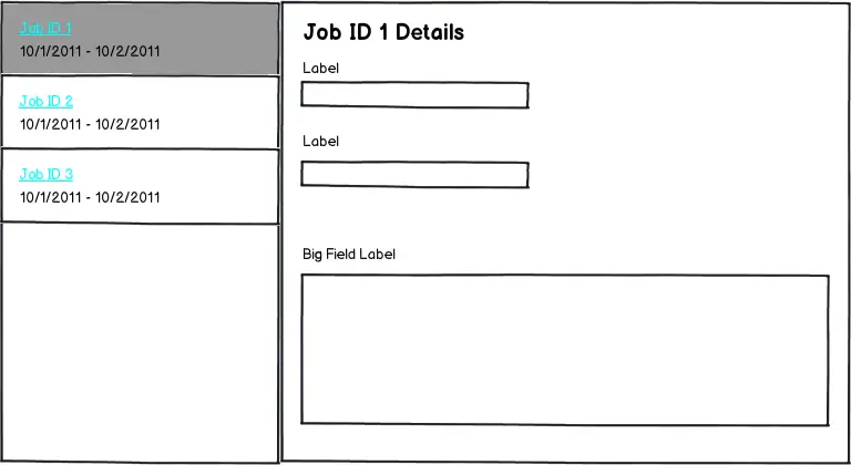
You already got a basic idea of what is a Master-detail design pattern. Now, let us get into more details. A Master-detail design is a type of UI design that has a master view and a detail view.
The master view displays a master list of items. When you click the item in the master list, then you can see the details of the item in the detail view.
Note in a web application, the master and detail view exists in a single page. If you click an item in the master, you can see the details on the same web page. You can identify it from the URL. Do not confuse a master-detail design with web page navigation.
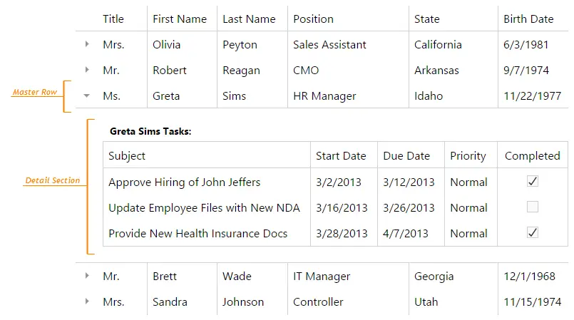
Master-detail design also represents one-to-many relationships for your data. The item that you have in master has many relationships in the details area. For example, you may use an application that shows employee records. In the Master area of the application, there could be employee names.
For each employee, you could see employee id, organization information, and personal details, and so on. Therefore, you see each master record having many relationships, and the Master-Detail UI is just the right design to present such data.
Where You Use It And Why?
You would find master-detail pattern used in web e-mails, online ticketing applications, web or mobile chat applications, many more.
You should use this particular UI design when:
- You think that the data is complex enough to fall in the category of list and details scenario.
- You need to switch between items frequently and want to edit or delete them but still want to stay in the same context.
What Styles You Can Use?
Master-Detail UI design is mostly of two types:
- Stacked: In this style, either the master or the details pane is visible at one time. You can select the item from the master list and drill down to the details pane. It might feel that the master and details pane are separate pages, but they are not. This style is suited for smaller screen space.
- Side-by-Side: In this style, the master and detail panes are visible together. This is more suited for wider screen space.
What Are The Elements Of This Pattern?
The Master-Detail UI design has the following key elements.
- Master pane: As explained earlier, this area contains a list of items.
- Details pane: This area shows the details of the particular item that you select in the Master area.
- Interactions: This is about the interactions between the items in the master and their details. For example, if you select an item in the master, the details could display in the pane next to the Master pane, or in a pop-up, or you could drill down more pages. You could broadly classify the interactions into in context, drill-downs, and pop-ups.
Master-Detail UI Pattern Case Studies
Now that you know the basics of the Master-Detail UI design pattern, let us now analyze a few case studies. Let us see how the Master-Detail pattern works for these examples.
Case Study 1: IRCTC (Stacked)
The ticket-booking website of Indian Railways is an example of a stacked style of Master-Detail design. Once you key in your origin and destination city of travel and dates of travel, you get to see the trains operating on a particular day.
What you see here is only the list of trains, which is the master area for you. If you click the Check availability & fare, then the details for that train is displayed in the details area. The train and its details are not displayed together at a given point of time.
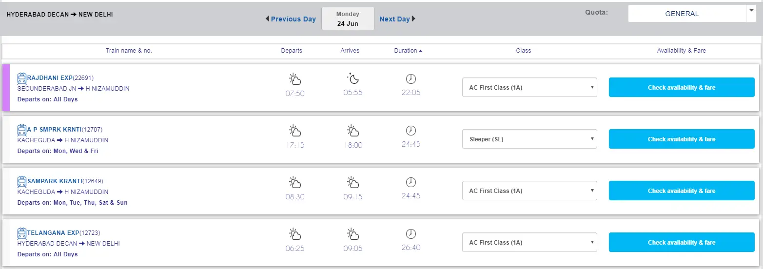
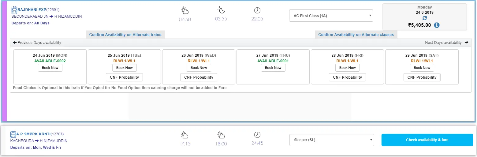
Does this style work? Yes, I certainly think so. The UI is clean, intuitive, and nothing is confusing. It also doesn’t have multiple levels of nesting of information that require you to go on drilling down on the details.
Case Study 2: Facebook Messenger (Side-by-Side)
Let’s see an example of a side-by-side style of Master-Detail design UI. An example that is now a habit to most of us 🙂 FACEBOOK Messenger. Here, I am talking about the web version of FB messenger, not the mobile one.

You can see the list of contacts in the Chats area, which is your master pane and the chats for each contact next in the details. Both panes are visible at the same time. An easy and fuss-free example of the side-by-side style.
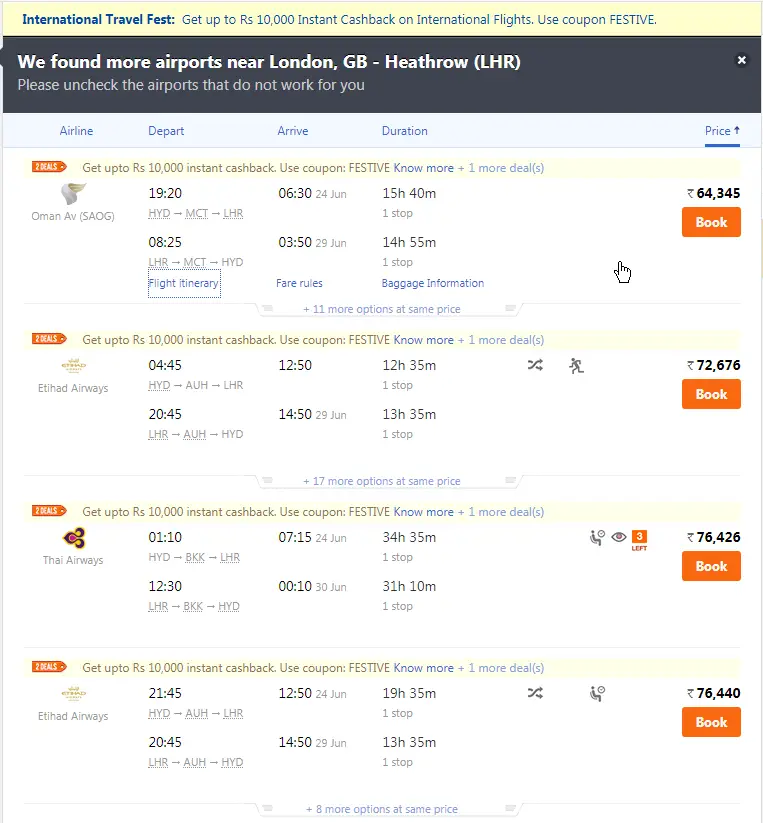
Case Study 3: MakeMyTrip (Side-by-Side)
Airlines ticket booking websites make an interesting case study for the Master-Detail design UI. There is quite a bit of detail that we see here, and the interactions are high too.
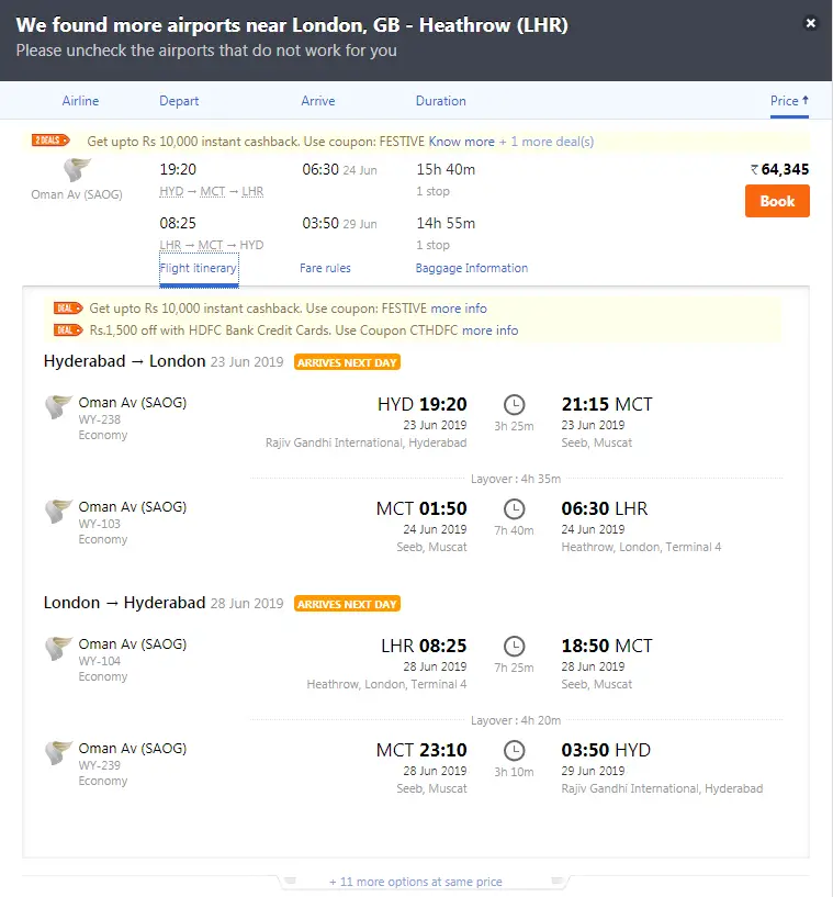
Make My Trip is a good example of the side-by-side style. After you key in the necessary details to plan your travel, you see the list of the flights. The master area is a table here, and you see the departure and return flight combinations.
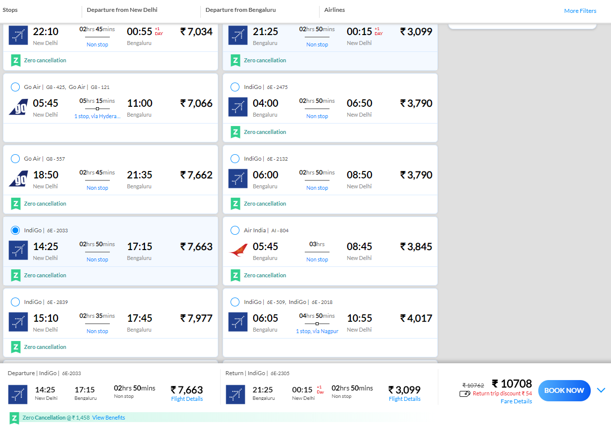
What is interesting here is that whatever flight combination you choose displays in the details area at the bottom of the web page. The Book Now option is available in the details area.
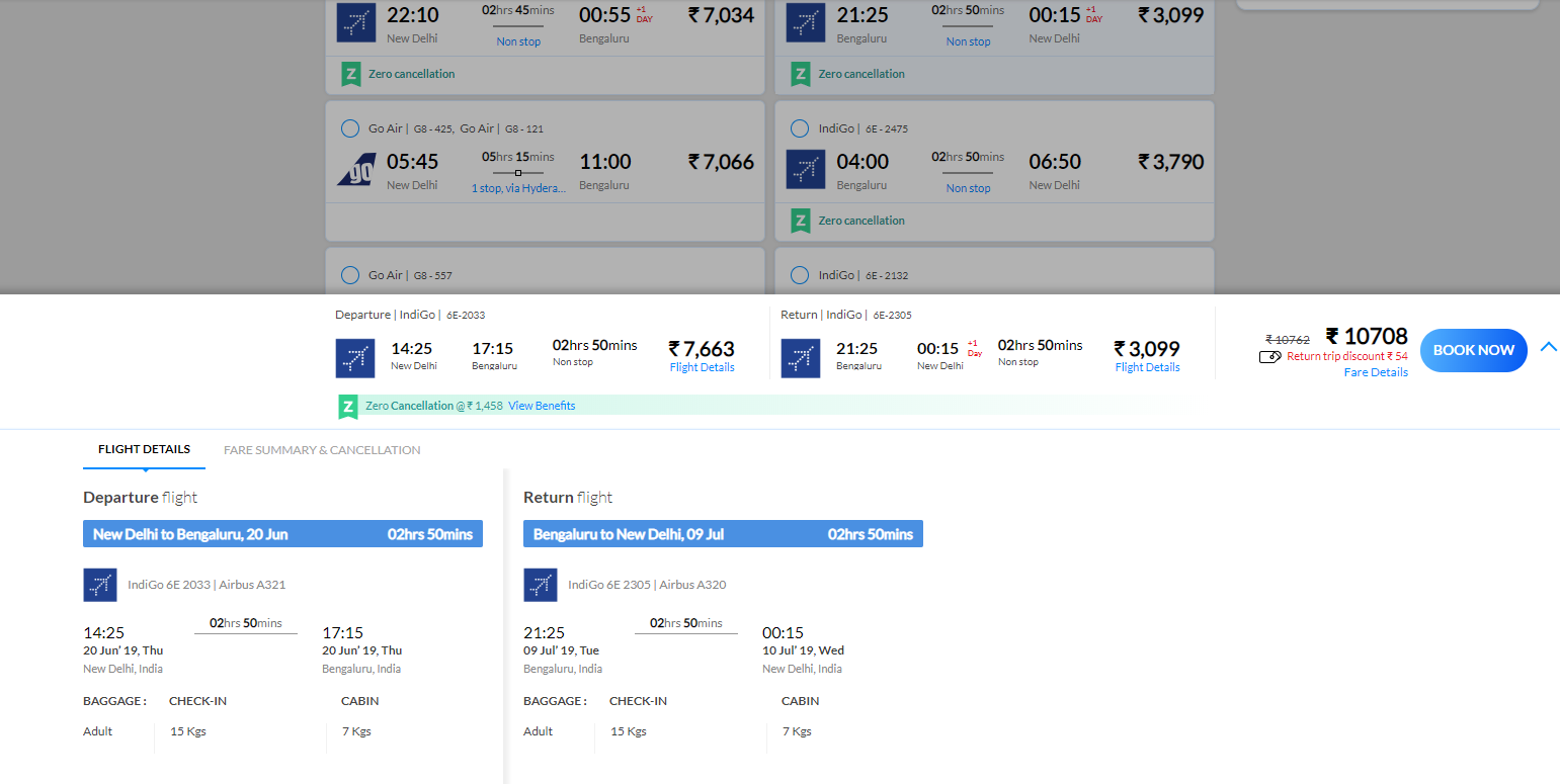
If you click the Flight Details link, then the flight details are further displayed in another details area. A good example of drill down interaction.
What I don’t find great in this design is that the details are displayed at the bottom of the page. As a user, I wasted a few minutes to figure out the details area. The details at the bottom of the page initially give you a feeling some scrolling ad, and then you realize it is the details area. The UX here could have been better.
Case Study 4: Cleartrip (Stacked)
Another interesting example of a stacked style in Master-Detail UI is of Cleartrip. This is again an online ticketing web application.
When you select your departure and return destination and dates, you only see the flight combinations, and no further details are displayed. You are in a Master area. Now if you click the Flight Itinerary link, then you can see the details in another pane, which is the details area.
The interesting feature here is if you want to see more flight options of the same flight combinations, and you click the link more options at the same price. Observe the screenshot.
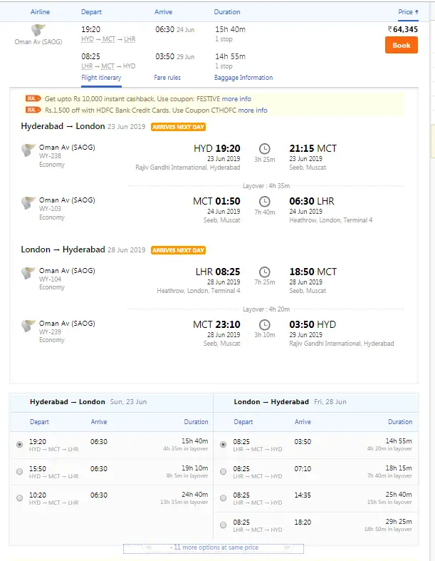
You can now see the Master pane, and the subsequent two detail panes are the same. You are still on the same page. However, you have now drilled-down two more levels. In short, your interactions have increased.
You can collapse the detail panes and go back to the master area.
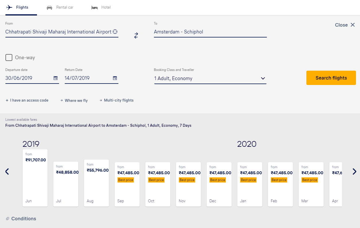
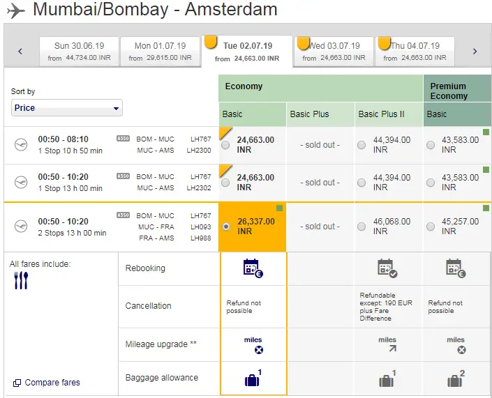
Case Study 5: Lufthansa (Side-by-Side and Stacked)
Lufthansa is an interesting case to study from both UI and UX perspective. Again an example of online-ticketing application.
First, the website has examples of both side-by-side and stacked style of the Master-Detail UI design. Second, it has interesting interactions.
Let us study this more in detail.
On the homepage, when you key in your travel destinations and departure dates, you immediately see list of flights displayed for a series of months. The look and feel is of a bar chart.
After you click on the month from this area, you are directed to another web page. However, the results are in a side-by-side UI style.
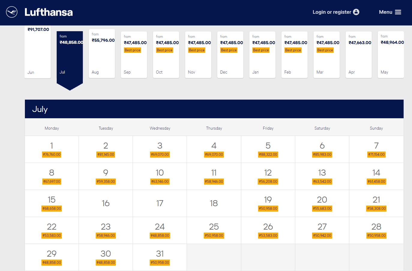
Here, the Master pane is the area, which displays months for you. After you select the month, the details pane is visible. You see the price of flights for each day of the month. The tabular form makes an easy read and is a good UX.
If you now click on a particular date, more details are visible, and it takes you to the booking page.
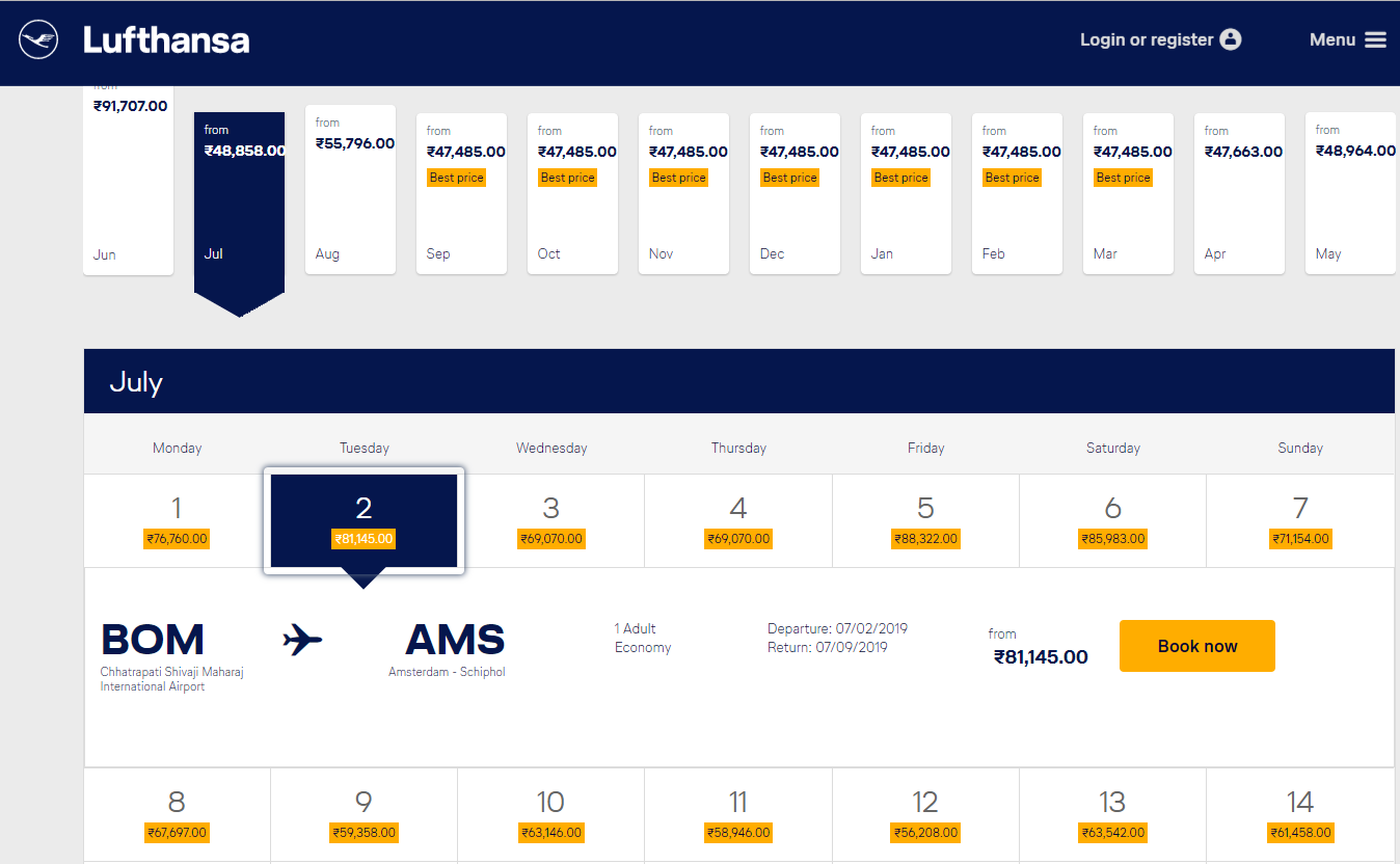
Note, the level of interactions here, but you are still on the same page.
Now, if you want to book your ticket, you click Book Now, and you are directed to another webpage. In this new page, you see tables for both departure and return flights. This page is all about the stacked style of Master-Detail UI.
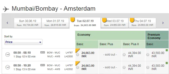
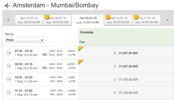
Both tables have a list of items in them and act as a master area. If you select any flight for a particular day, then only you can see the details, which is essentially a feature of stacked style UI.
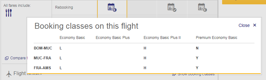
You do observe the interactions here are interesting. First, you can see you have a tabbed view for different days. Second, if you click the Show Booking Classes link, you see the details now in a pop-up.
In one web page, you could see master areas, details panes, and interactions with data in the form of tabbed views and pop-ups.
While I find Lufthansa slightly complex, but it is a great example where you can see both styles of Master-Detail UI in different web pages.
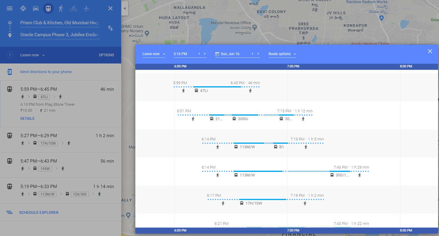
Case Study 6: Google Maps (Stacked)
Taking a break from the ticketing applications, another example of the Master-Detail UI is the web version of Google Maps.
It is a simple example of a stacked style of UI. If you want to see the directions and various options of how to get from one destination to another, key in those details. First, you only see the list of options, which is the master area here. You do not see any other details of the options in the master area.
If you select an option from the master area, you see the details. However, you cannot see the master area now. If you want to go back to the master, you need to click the arrow on top of the details pane.

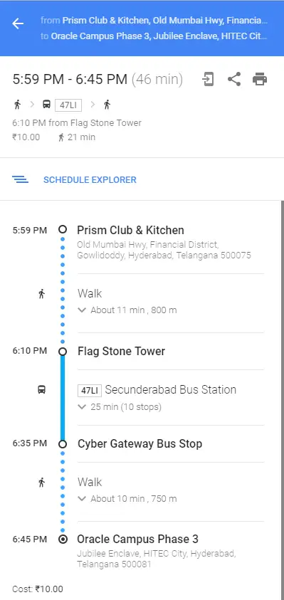
If you chose public transport as your mode of commute, then you would definitely want to see the schedule of the bus or the train, or any other mode. When you are in the master area of the selected option and click Schedule Explorer, you see the details in a pop-up.
Conclusion
Now that you have seen some examples of the Master-Detail UI design pattern, let’s summarize the learning. Some examples are simple, and some are complex in comparison. You might feel overwhelmed with these examples and wonder what features you could implement from them if you had to design a Master-Detail UI for your web application.
Well, you need not stress. Keep these following considerations in your mind to get your design correct.
- Study your business need and the type of data you have. Analyze if the Master-Detail UI design is the best way to handle it.
- Analyze how complex your business is and what medium you plan to use. Are you planning to do a web application or a mobile application?
- Most important, think about your user. Understand the level of complexity that you want to expose to your user. Design your interactions accordingly. Avoid too much of nesting. Your user might get frustrated with never-ending details.
Remember that nothing is more important than a great UX. You might achieve a technical brilliance with your UI, but if the user has not so great experience using your application, then design is a futile exercise. Keep the design simple and keep the user experience AWESOME.