
Dashboard is usually the one page that the users see first thing in the web application.
It is the page that shows the analysis of the application’s data, trends, summaries etc. In many cases it dynamically reports important pieces of data from the web application. From the Dashboard the users can drill down to get more information about a particular piece of data.
This is the general understanding of what Dashboards are and do.
So how do you make sure that your Dashboard design adds value to the users of your web application? That is exactly what I plan to answer in this article.
I will talk about Dashboard design for web applications that are to be used by businesses but the same concepts can very well be applied to Dashboards of almost all the web applications.
But before that let me clear one misconception about Dashboards.
Dashboards are Not Reports
The general thinking that goes into any Dashboard design is that it is all about showing analytics, trends and summaries of the data in the web application using various charts and diagrams.
A good example of this is Google Analytics which shows you the details of the traffic coming to your website.
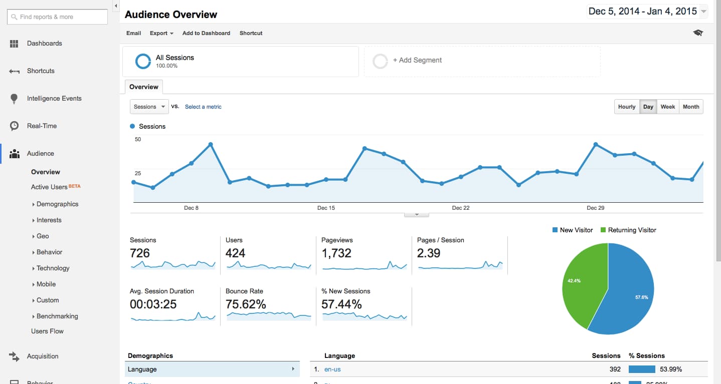
You could design a similar Dashboard for your business web application that shows analysis of important data.
But for business web applications if you just want to show a high-level summary or analysis of the business data, then why not create a Report? Why do you need a Dashboard?
You could very well give the same condensed summary and analysis to the users in the form of a Report or multiple Reports.
So why do you need Dashboards? How can Dashboards add value to business web applications?
A Good Way to Design Dashboards
Dashboards should not only show the summaries, trends and analysis of the application’s data but should also let the users take action on that data.
If Reports help the users to understand what action is to be taken for the data being presented then a Dashboard should do the same thing and enable the users to take action on that data.
Think of Dashboards as a superset of Reports.
A good example of this is the WordPress Dashboard, which is the CMS (Content Management System) behind many of today’s websites.
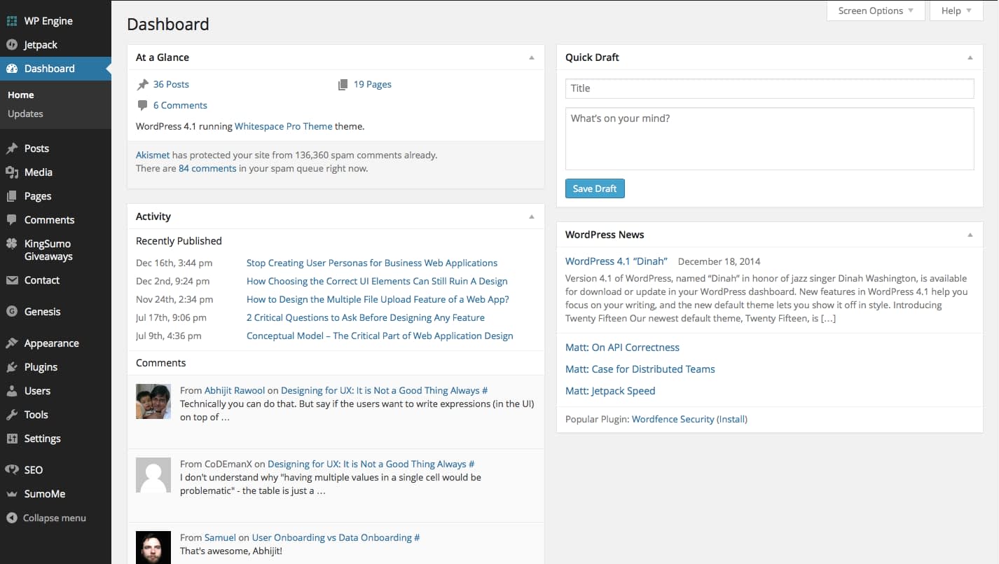
WordPress nailed the Dashboard Design by not only showing the relevant summaries of the data but also by letting the users take action on that data.
This Dashboard lets you to quickly see the number of articles you have written and the count of spam comments. By clicking any link, you can drill down to the relevant page that shows more information about those articles or comments.
It even lets you to write an article quickly and publish it without having to go to another page.
A good Dashboard should not only show the relevant information quickly to the users but should also let the users to quickly act on that data.
But there is always an exception…
The Exception
In most of the web applications you should be able to design Dashboards that let the users take some action on the data.
But some Dashboards are purely meant for displaying information, like the Google Analytics Dashboard above. There is hardly any action that the users can take on the Google Analytics data because it is just a reporting tool.
In such kind of Reporting Dashboards you would just show the relevant information without any actions.
Designing a Good Dashboard
I am not going to talk about how you can visually design a better Dashboard because that is something that should ideally be done as the last step of the Dashboard design after you have nailed the following three things:
- What data needs to be shown to the users
- How to present that data to the users and
- What actions should you let the users take on the data
You can do a really good job of nailing all of the three things above if:
- You know the users of your web application very well
- You know the different types of users
Let me talk about each one of these in more detail.
Know Your Users
You should have a very good understanding of what questions the users of your web application will have when they open up your web application.
The Dashboard should be designed to answer those questions.
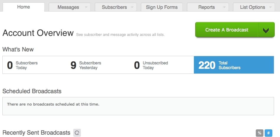
Aweber is an Email Marketing company that lets you collect email addresses of people who show interest in hearing more from you.
You can simply create a form asking for name and email address. Anyone who wants to hear from you can enter their name and email in that form and then those people get subscribed to your list. You can then send out any announcements to this list of people.
Let me ask you this, if you were to use Aweber to collect email addresses of other people, what is the one question that you would like to get answered on logging into your Aweber account everyday?
I am sure; it would be to get a quick view of how many people have subscribed to hear from you today or the total number of people who have subscribed to hear from you.
So what does Aweber show? It shows exactly that.
Dashboards should always answer the questions that users will want to get answered on landing inside the web application.
This is really a good way to start off your Dashboard design.
The next thing that the Dashboard should do is to let the users quickly take the most frequently used action right away.
Why do you think WordPress lets the users to quickly publish an article from the Dashboard itself?
Aweber too does the same thing. After you have seen the number of subscribers, the most likely action you would like to take is to send out an announcement. So Aweber displays a big button to send out announcements which it calls Broadcasts.
Letting the users take the most frequently used action from the Dashboard itself saves a lot of time.
Know the Types of Users
Almost every business web application is used by different types of people. Before starting the design of your web application, you should have done user classifications and found out the different types of users of your web application.
For businesses, usually this classification is on the basis of the business roles.
Now suppose you are designing a web application that sells tickets to the employees of a company for the various Events conducted by the company.
The employees interested in purchasing the tickets to the Events would want to see the list of Events upfront while the Managers might want to see how many of their reportees are going to various Events. Similarly, the Vice President may want to see the revenue collected for the Events.
Different types of users will have different needs.
To meet the needs of the various types of users, you need to display different Dashboards to them.
Yes, it is more work but then it is not a good idea to display the same Dashboard to all users and then let them drill down to get the information they are looking for. It just won’t give a better user experience.
Now that you know the users and the needs of different types of users, you will find it easy to figure out what data to display on the Dashboard, how to display it and the actions that you can let the users take on that data.
Visual Design of Dashboards
It is extremely important to have a good visual design of the Dashboard. If you are to put efforts in beautifying your web application then put it in beautifying the Dashboard.
Dashboard is something that usually finds it way in all the sales and marketing materials. It is one thing that will represent your application. So it better be good.
Apart from that, a visually good Dashboard is usually easy to read and understand.
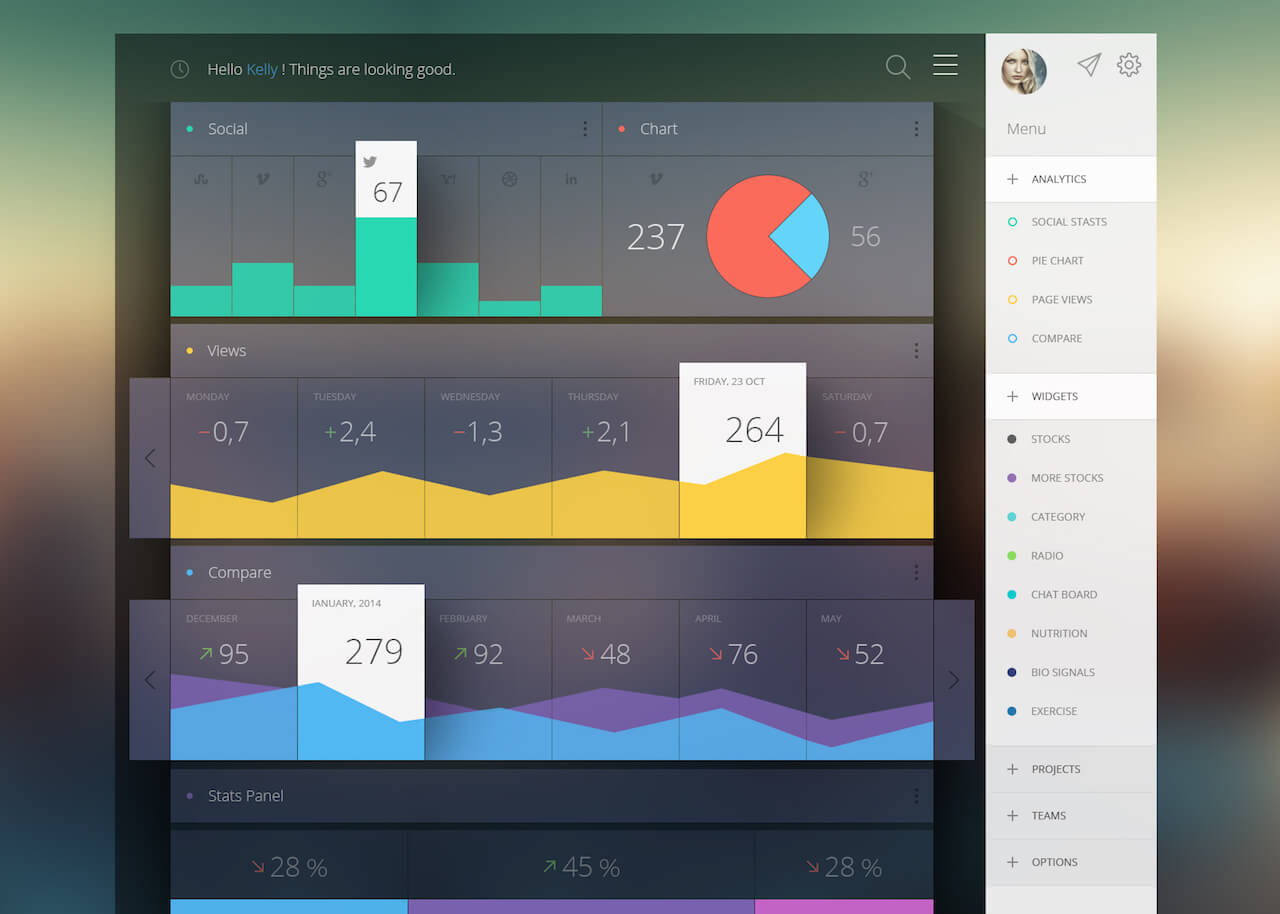
Here are some Dashboard designs to inspire you.
Some Analytics by Cosmin Capitanu
iPad Dashboard by Davide Pacilio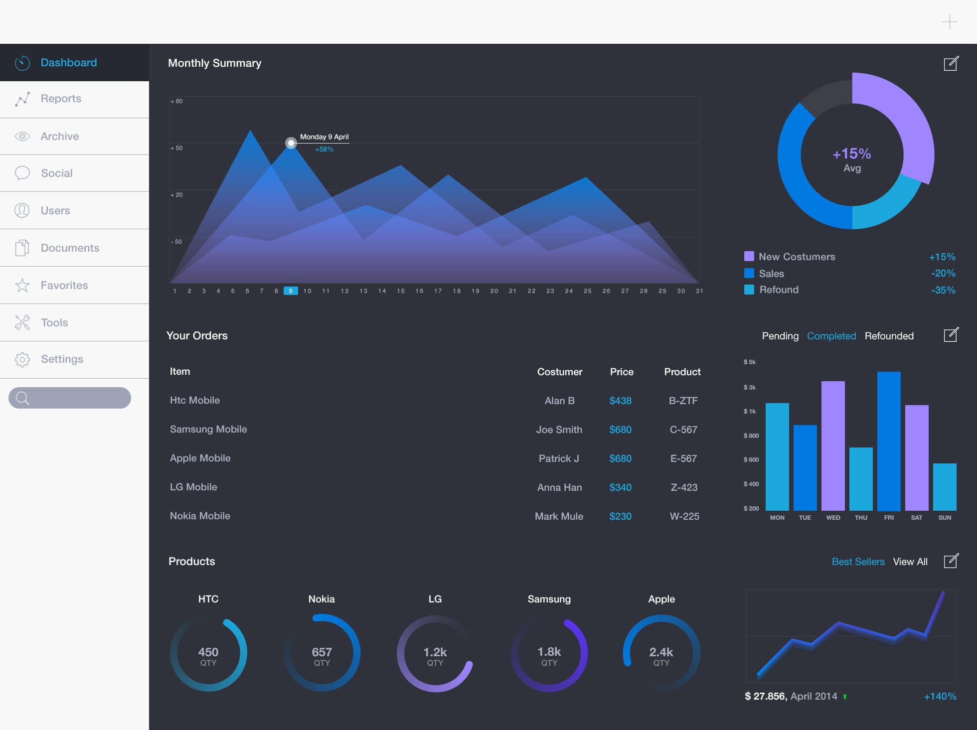
Dashboard by Joshua Iwata
Spanish Flat Dashboard by Robin Marquez
Should You Design Customizable Dashboards?
The design of the Dashboard can get really complex if you are designing a web application that will eventually be used by people in various departments of an organization.
The needs of so many people are going to vary a lot.
In such cases, you are bound to think of designing a Dashboard that the users can customize on their own to see the data that they are interested in. You could let the users drag and drop various data widgets on the Dashboards as well as let them configure what data should be displayed in each widget.
Such kind of a Dashboard can easily meet the needs of almost every user.
So should you design such Customizable Dashboards?
One word answer, No!
There are 3 main reasons for not building a customizable Dashboard:
- It just shows that you are not really aware of the needs of your users, which is very big question mark on why you are designing the web application in first place.
- Probably you do not realize that the amount of work needed for designing, coding and testing such an interface is huge. You need to think of every possible scenario of what happens when the drag is unsuccessful, layout issues of each widget, how to let the users display the data they want to see etc.
- The need for a Customizable Dashboard can quickly be overcome by designing different Dashboards for different types of users.
The Broader Picture
A well-designed Dashboard can really add a lot of value to the users of your web application.
It will give them a way to quickly see the important business metrics and take actions to improve those metrics.
But designing dashboards and web applications that are truly useful to the users is more difficult than designing good web applications.
If you want to learn how to design such web applications that people will find useful and love to use then checkout Step-by-Step Web App Design book. It is a step-by-step process that you can use to design any web applications.
Very good tutorial
This was awesome. And its just one part of the story. Good read though.
merci !