
Few days back we discussed how to design Advanced Search interface. Today we will talk in detail about some of the important considerations to keep in mind while designing Faceted Search.
So what is Faceted Search exactly?
Once a user has given a search query and we have presented a large number of results, how does the user narrow down the results to what he is actually looking for?
Faceted search comes in handy here in which we present the properties of the objects in the search results to the user for selection. We can group these properties into meaningful groups presented in Facets.
The user can now narrow down the results by selecting the properties from the facets.
You can see the Faceted Search in action on Amazon.

Faceted Search is called as Faceted Navigation by some of us. But is it really a Search or Navigation design pattern? Or is it just a filter on the Search Results?
We can keep arguing on this for a long time. But that is not the purpose of this article.
Whether we call it Faceted Search or Faceted Navigation or Search Results Filter is immaterial and does not take away its importance in helping the user narrow down the search results to find what is needed.
This is the reason why Faceted Search has become a de-facto choice for almost all the eCommerce sites, right from shopping related to travel related and in some cases even for online libraries.
Given below are the important considerations to look at while designing Faceted Search:
- Placement of Faceted Search Region
- Default State of the Facets
- Types of Fields in Facets
- Displaying Values within Facets
- Interactions between Facets
- Refreshing Search Results and
- Clearing Selected Values
1. Placement of the Faceted Search Region
Where to place the facets is an important design consideration.
Common sense tells us that we can place it either on the left side of the search results, right side, on top or at bottom of the search results.
Each of the placements has its pros and cons.
Amazon places the facets on the left side.
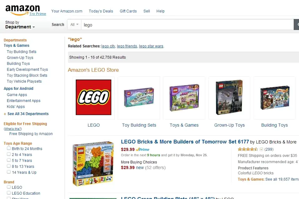
This is the most common placement of the facets. One of the primary reasons for placing the facets over there is that it is always visible even if you resize the browser window.
However if your website or application is built for languages which read for right to left, this might not be a good placement for you.
The University of Edinburgh places the facets on the right side.
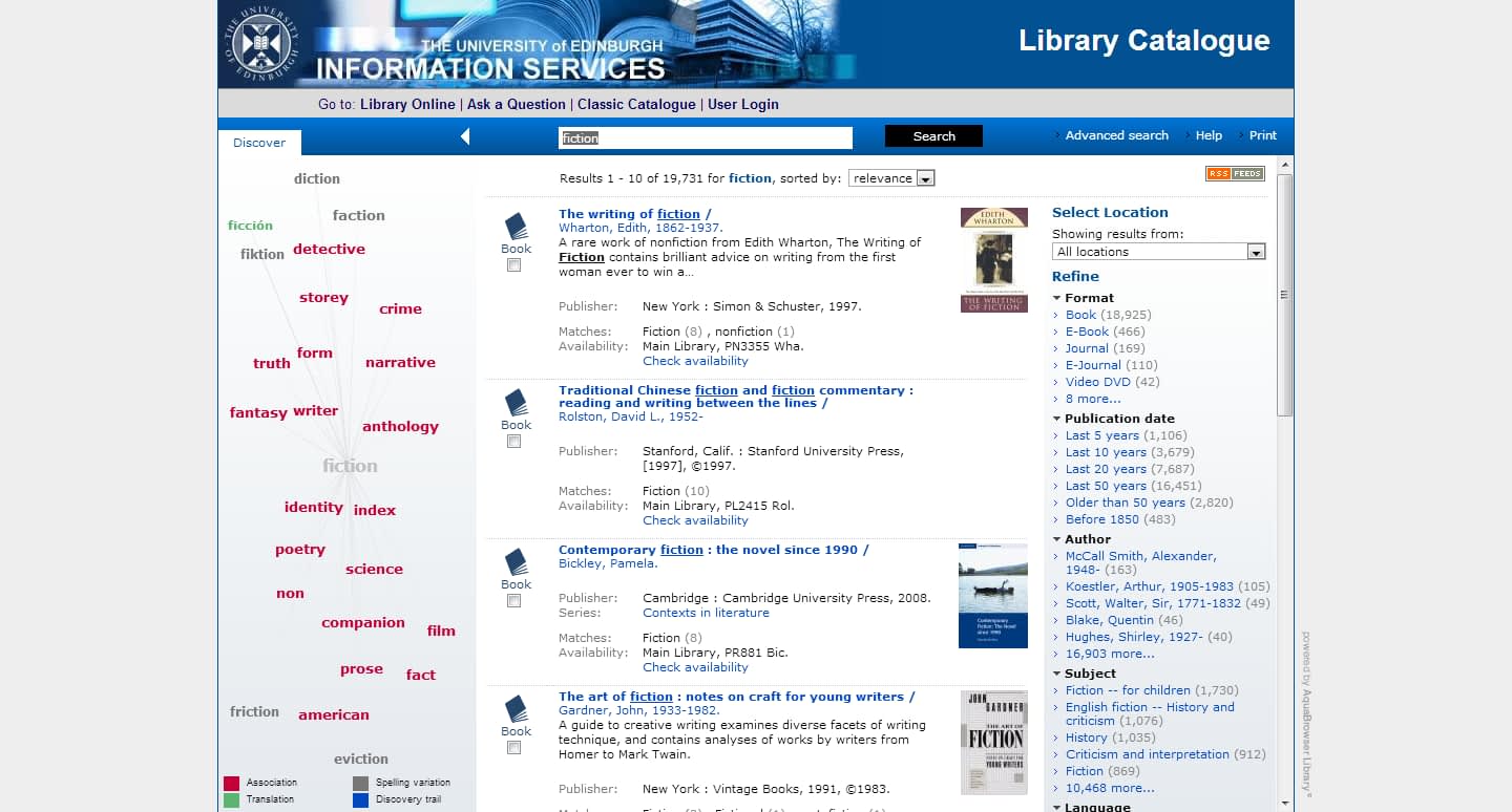
In this case, I think the decision to place the facets on the right side was taken to highlight the discovery map which is placed on the left side.
Other than that I cannot think of any benefit of placing the facets on the right side.
Digi-Key places the facets on top of the search results.
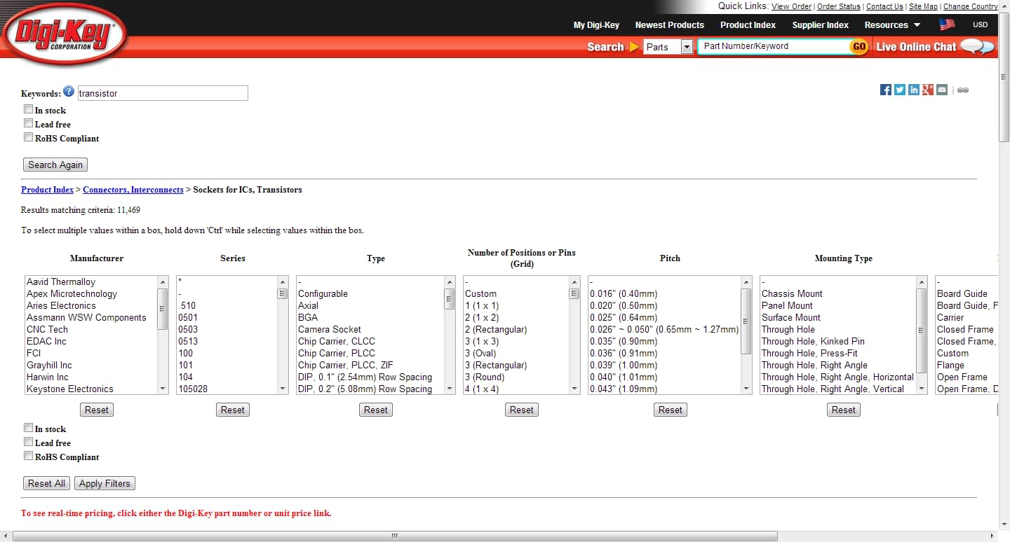
This placement obviously makes it difficult to overlook the facets. However, this approach is not going to help you if you are dealing with large number of facets because either you will exceed the page width or take up too much space on the top.
This makes the search results region almost invisible and the user will have to scroll down the page to look at the results and then back up to refine the search. Not a good user experience in my opinion and I think you will agree too.
Hoovers places the facets right below the search results.
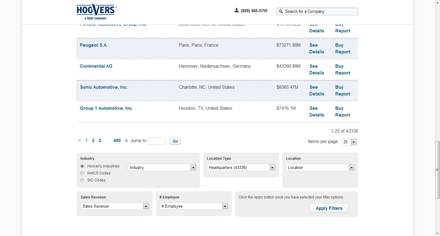
This presents the search results to the user right away and they see the facets only after they have scrolled down completely to the end of the page.
This placement makes sense considering that if the user has scrolled down right to the end of the page, it means he has not found what he is looking for. So it makes sense to show the facets at the end.
But again if you have number of facets to display, then you will face the page width constraints. Also, if the user wants to keep filtering the results, he will have to unnecessarily keep scrolling down the page to add a new filter.
Make My Trip implements a hybrid placement. It has the facets arranged on left side as well as on top.
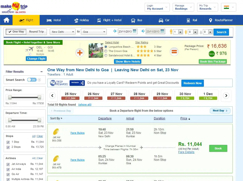
Placing the dates on top looks to be an intelligent decision because it visually gives a clue of which dates are sold out vs which are available and the user can select the dates accordingly.
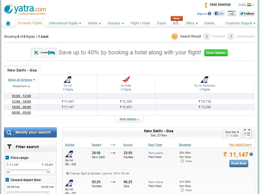
Yatra goes a step further by displaying a facet with a matrix showing the available airlines, flight timings and cost of tickets.
So, which is the best placement? I would say it depends on what you are building.
But the popular choice is the left side placement and the hybrid placement which you will find implemented on most of the user interfaces.
2. Default State of the Facets
The next consideration is whether to show the facets always open or closed by default.
In all of the above examples you can see that the facets have been displayed in the open state by default.
The reason is obvious, that is to display the values to the user with which he can narrow down the search results.
And this is the most commonly implemented state in most of the interfaces with less number of facets.
So when should you consider displaying the facets in the closed state by default?
The only reason, I can think of is when you want to display a large number of facets. In this case you can think of implementing the closed state by default.
Also, in this case displaying the facets in open state by default might not be desirable as this can result in the facets region being lengthier than the search results itself.
Linkedin actually uses a hybrid approach. Some facets are open by default and some are closed.
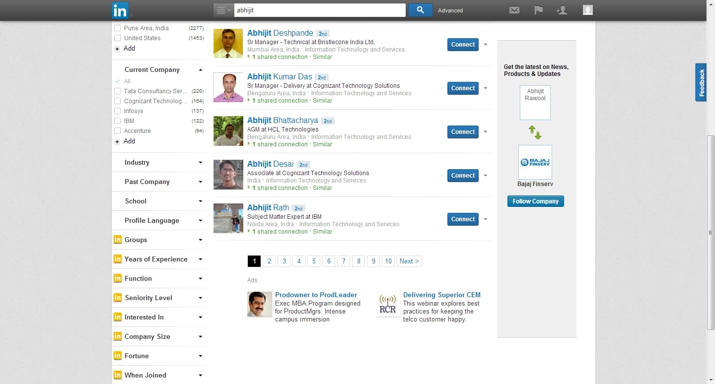
With this approach you can display the most important; the ones you think will be helpful for the users in narrowing the search, in open state and collapse the others.
The users can expand the closed facets when needed.
This also takes care of the facets region being lengthier than the search results.
3. Types of Fields in Facets
The next consideration is what types of fields to show inside the facets.
The most common types are the hyperlinks and check-boxes. Though you can get innovative and display other types of fields to make the user experience more streamlined.
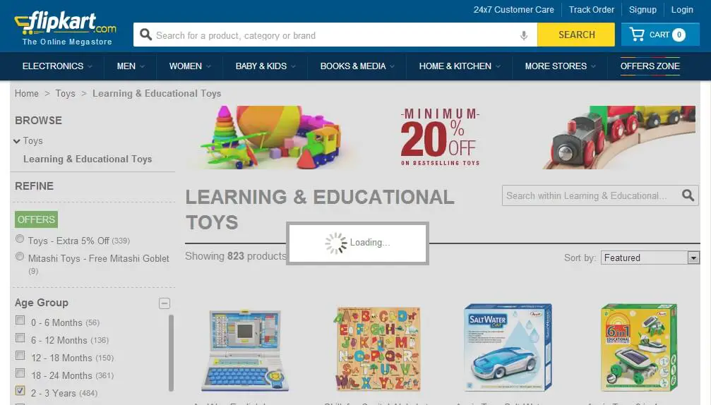
Check Boxes
Check boxes are commonly used field types in facets. You can see them implemented in almost all the facets you see.
Here is an image from Amazon’s facet displaying check-boxes.
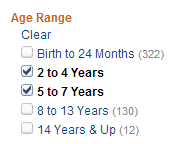
These are mostly used for criteria which can be multi select in nature. Meaning, the user can select one or more values in the same facet.
In Amazon’s case, the user can choose to view results for the age group of “2 to 4 Years” as well as “5 to 7 Years” at the same time.
This means an “OR” condition is at work when the user selects multiple values within the same facet thus displaying results for both the age groups at the same time.
Hyperlinks
Hyperlinks are used mostly for single select criteria. Meaning, the user can select only one value within the facet at a time.
A good implementation of it can be seen on Amazon where hyperlinks are used to drill down into the department.
The user can only select one value at a time.
So the next question which comes into mind is whether we should display the rest of the hyperlinks once a user has selected one of the hyperlinks?
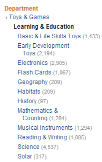
If the values are hierarchical in nature then it makes sense to show the links which are child to the selected links and hide the peer level links. Similar to what Amazon has done for its Department facet.
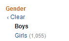
But if the values are not hierarchical in nature then it makes sense to show the rest of the links. Amazon does this with its Gender Facet.
Linkedin uses a slightly different approach where selecting one of the values hides the other values. But they can be accessed by clicking the More… link.

Radio Buttons
These could be seen as replacement to hyperlinks.
Flipkart uses these to let the users select one of the running offers.
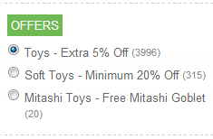
Frankly I cannot really see any value addition in using them because they too will follow the same single select pattern which hyperlinks do.
Also, I haven’t seen many interfaces which have implemented radio buttons.
Color Choosers
These can be commonly seen in clothing sections of any shopping site.
An example of this can be seen on Amazon.
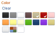
The small check marks indicate that those colors have been selected by the user.
Flipkart also displays the color chooser as one of the facets. But unlike Amazon it arranges the colors vertically and provides a check box for selection.
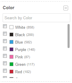
I think the primary motivation to present the colors vertically was to show the name the color alongside it. However, will users be interested in knowing the name of colors? Even for argument sake if we consider that user will be interested in knowing the names of the colors, I think this can also be accomplished by showing the name of colors as tooltips.
You can see a noticeable amount of screen space is saved by Amazon’s implementation of color chooser against that of Flipkart.
Range Sliders
These are sliders which allow the users to select a range.
Yatra allows selecting a price range for the air tickets in one of its facets.
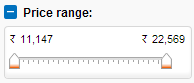
In this case the user is expected to slide each end of the slider to define the range.
Does using a slider help the user in any way? I think the only advantage is that the user can define a range himself. However even that can be accomplished without using a slider as we will see in a short while.
One disadvantage of using the slider is that once you move one slider the search result refresh and then on moving the second slider the results refresh again. This can be a bit of an annoying experience for some users.
Flipkart allows choosing between pre-defined ranges.
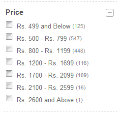
Interestingly it uses check boxes for selecting the ranges. This implies that the user can select multiple ranges.
Will any user ever try to see the results in the price ranges of “500 to 799” and “2600 and Above” at the same time?
I think it’s very unlikely.
Amazon takes a different approach to defining ranges. It uses hyperlinks.
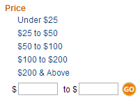
So it means user can select only one of the pre-defined ranges at a time.
But what Amazon also does is that it allows the user to define a range by providing text boxes at the end.
This overcomes the slider’s disadvantage of refreshing the results on setting one of the values of the range.
Other Field Types
You can pretty much get innovative at what you place inside the facets. Right from graphs to star ratings to buttons, you can place anything as long as it makes sense for your users.
4. Displaying Values within Facets
Here are some things to consider while designing the display of values within the facets:
- Arranging the Values.
- All Values or Subset of Values
- Count of Results
Arranging Values
The first question that comes to mind when designing the values inside the facets is how to arrange them.
Should they be arranged alphabetically or the value with the largest set of results should be displayed first.
The best approach is to use different approaches for different facets. It is difficult to apply the same rule to every facet.
Amazon uses this approach.
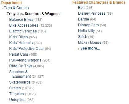
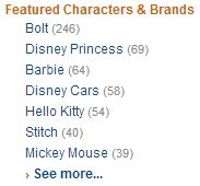
The values under “Tricycles, Scooters & Wagons” category are arranged alphabetically while the values under “Featured Characters & Brands” category are displayed with the values having largest number of results on top.
All Values or Subset of Values
The next designing consideration is whether we should display all possible values within the facet or only some values.
The decision in this case is quite simple.
Display all possible values if the number of values is less. Exactly how many may depend on the screen space you are dealing with.
Display only some of the values, if the number of possible values is more. You can give a “More…” link so that the user can view the rest of the values.
The biggest challenge is how to display those additional values.
Amazon takes the user to an entirely different page to select the additional values.

Selecting “See more…” link takes the user to a different page showing all the values where the results are sorted alphabetically. Selecting any value on this page takes the user back to the results page and applies the selection to the results.
This can be a little disorienting to the user when all of sudden he is taken to an entirely new page.
The other approach to design this interaction is how Flipkart does it. It restricts the vertical length of the facets and gives a scroll bar to scroll all the values. This way the user is not taken to an entirely new page.
It also provides a Search box inside the facet at the top so that the user can easily find the value within the facet.
The third approach is what 99 Acres does. It flies out a menu to see additional values.
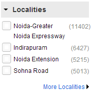
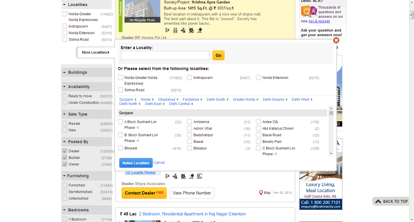
Clicking on “More Localities” gives a fly-out menu which contains additional values.
Though the transition of the fly-out menu on the 99 Acres is not very subtle, you may still want to consider the fly-out menu option to display additional values.
Count of Results
It is also very useful to display the number of results the user can expect to see on selecting a particular value.
In all of the above examples you will see this implemented. A number in displayed in brackets right next to the value.
This gives a visual clue to the user as to which values will give him more number of results.
5. Interactions between Facets
In design consideration number 3 we saw how values will interact within the facets.
For example, hyperlinks will be single select and may or may not hide the other hyperlink values within the facet. While check boxes will support multi select pattern most of the time.
But does selecting a value in one of the facet affect values in another facet?
It does surely.
Then do we hide the values of facets which are no longer valid after selection of values in some other facet?
Well, the argument can be made either ways.
Hiding the irrelevant values may result in the user never knowing the possible values he could have seen if he had not selected the values that he did in other facets.
If we show the irrelevant values then the user may select it which could result in zero results. We can disable the irrelevant values but now the user gets into a dilemma of how to enable them. This would result in a series of selection and de-selection of values in other facets which can go into a loop thus giving a frustrating experience to the users.
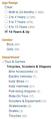
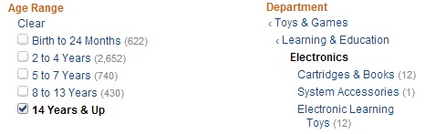
Amazon hides the irrelevant values from other facets.
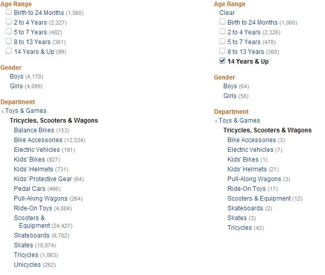
You can see from the above image that selecting age group of “14 Years & Up” in Age Range facet has resulted in some values being hidden in Department facet.
Flipkart takes a different approach. It displays the irrelevant values in disabled state.
As you can see, selecting “0 – 6 Months” value in Age Group facet results in some values being disabled in Type facet.
So which approach should you use?
I personally like hiding the irrelevant values but would recommend that you properly think through your user flows before deciding on either of the approaches.
If you are designing a web application then your aim is to get the user to the relevant result quickly. In this case you can think of hiding the values. But if you are designing a shopping portal then your aim is to keep the user on the site. Here you can consider displaying the values in disabled state.
Also, one more thing to be kept in mind while designing interaction between facets is that the values selected in multiple facets will use the “AND” condition between them. Meaning, only those results which satisfy all the selected values will be displayed.
While the values selected within the same facet will use the “OR” condition between them. Meaning, results which satisfy any of the selected values will be displayed.
6. Refreshing Search Results
Some thought also needs to be put into how you will refresh the search results.
Most of the implementations which you will see online will refresh the results as soon as a value is selected in any of the facet.
Amazon refreshes the entire page on selecting a facet value.
While Flipkart shows the processing indicator as a modal window.
This kind of transition looks better than what Amazon has implemented because the user never loses sight of results he was looking at. It doesn’t disrupt the flow as Amazon’s implementation does.
In both of these examples, the results get refreshed immediately on selecting a value in one of the facets.
Monster India gives a button in each facet to refresh the results.
The results do not get refreshed until the Refine button is clicked.
Though technically this might look a better choice, from user experience it may not be the case.
Here the values in other facets will not get refreshed until the user hits the Refine button thus resulting in invalid values being shown in other facets.
This can further result in the user selecting a combination of invalid values which would return zero results. And then the user is left with the task of finding and removing the invalid values to see some results which can be very annoying for the user.
7. Clearing Selected Values
All is good while the user starts out with his search.
But you also need to consider how the user is going to clear the values he has already selected in the facets.
He can do it one by one which can be a very frustrating experience or you can provide a clear action to the user.
But clear action will not make much sense in cases where the values inside the facets are hierarchical in nature.
A good implementation of this can be found on Amazon.
Amazon displays a Clear action for non-hierarchical values and shows a Less Than symbol “<” to indicate that the user can go back in the hierarchy for values which are hierarchical in nature.
Faceted Search in Web Applications
You might be thinking that faceted search is good only for eCommerce sites and might not be useful within a web application.
However that is not true at all. There are many web applications which deal with large chunks of data like ERP, PLM or other enterprise web applications.
Letting the user get to what he wants quickly and easily is of paramount importance in such applications.
Unlike eCommerce sites where we would want users to roam around to get a feel of all the offerings, enterprise level web applications aim to get the user quickly to the result.
And this is where faceted search can be very useful.
I once designed faceted search for a page which was showing nothing but errors that have occurred in the system. Faceted Search gave a quick way to filter the errors based on their types which needed immediate attention.
So don’t think that faceted search is useful only for eCommerce sites or online libraries.
But designing such a search feature for web applications is not so straight forward. You have to pay a lot of attention to the requirements and design of the other elements as well.
Designing web applications is a lot more complex process and that is why I wrote an entire book on designing web applications. This book will teach you about every aspect of designing web applications not just search.
This article has really got long now but I hope you have good idea of how to go about designing faceted search.
If you think there are other considerations which should be looked at while designing faceted search then let me know in the comments below.
And as always please share this article with your friends if you found it helpful.